Alasdair Critique
Alasdair attended our Weekend Extravaganza where we covered Portraits, Nudes and Fashion. The course was run in conjunction with the RPS Digital Imaging Group. Graham Whistler and myself were the course tutors.
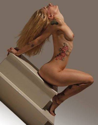
I really like the dutch angle on this one, because of the very rectilinear objects it really works well. It also makes Nikki Pixie fit really well into the frame and stops the image being windy. The varied angular lines running at many different angles across the frame make for a very dynamic image. Nice work - good thinking.
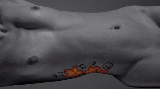
I know why you did this, but I'm not a fan of spot colour, it smacks of the Seventies to me - a bit chiched. The rotation to landscape is interesting, but I'm not convinced it works here.
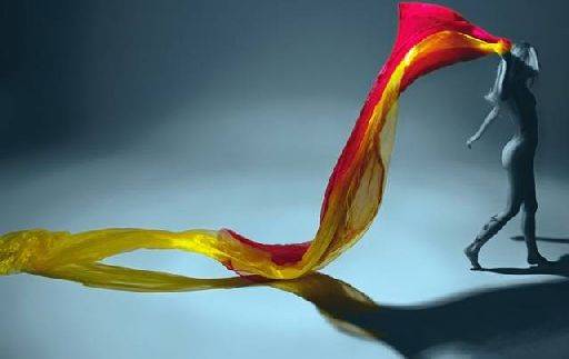
Having just said I don't like spot colour I think this is very cool. Making the figure a small, unimportant part of the image is correct, because it is the flow of the cloth that is so important, yet the figure makes sense of the image as a whole and locks in a reality instead of it being abstract, There's some really nice and well thought out photoshop work here creating the reflection of the drape, especially the way it runs from colour to monochrome.
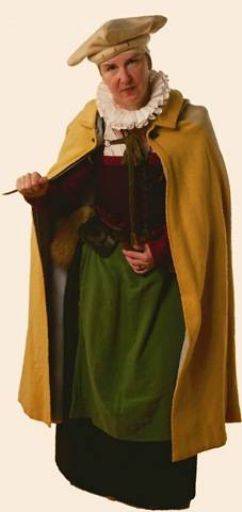
Good full length portrait, though for me it is a little wide angle - which in turn has led to a foreshortening in the legs. While the costume suggests a full frame image, in fact there is not much happening in the lower half and this could be lost altogether. The crop is a bit on the tight side - something I do a lot as well - but is maybe a little too tight here.
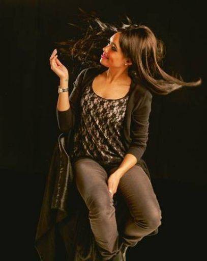
As with the previous image, the bottom half of this image could be lost and would be much stronger as a result. Portraits are a bit like war photography, if the image isn't strong enough you're not close enough.
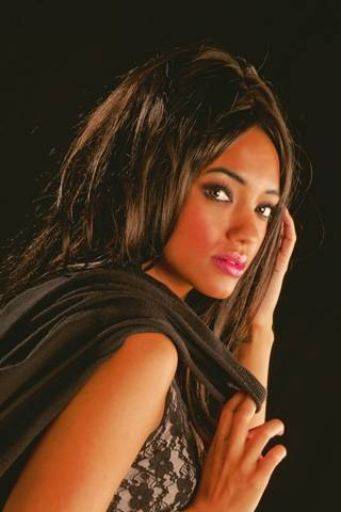
And this image too could benefit from being really tightly cropped just across the face in a landscape format - just above the eyes, just below the lips. That said, this is a nice image, nice sweeps of line, interesting expression, The jacket over the shoulder nicely reduces the amount of high-key skin that most shoulders shots have.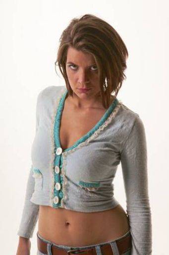
Lighting has gone a bit awry here. There's an odd over exposure in the image, almost like the flash off the cove has flared in lens reducing the contrast, or it may be that you've used some correction to bring the exposure up from an under-exposed image?
That aside, normally I would complain about the cropping the hands off - but actually I think you are correct here, since the image needs that little bit of base in the belt and top of jeans but no more than that. Love the expression and the tummy.
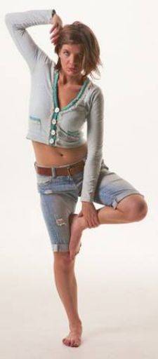
Same exposure comment as above. Good thinking all round. I'm not sure the non-standard crop works. I would have been more tempted to keep a 2 x 3 proportion image, but withe Niki-Marie placed on the left hand side up the rule of thirds.
share:
I run regular workshops for beginners and experts alike. I like to run a mix of styles and types. Masterclasses, portfolio builds, technical and artistic sessions available.
Current courses available.