AOP part 1: The first shot

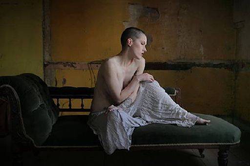
This was my first image of Maja.
I was completely blown away. I remember jumping up and down exclaiming, "Oh my God, that's perfect!"
The light, the pose, the expression, the colours, the shadows - all of them were gorgeous to me.
The whole image is redolent of a certain style of painting, with a fairly muted colour scheme. The shadows create a perfect chiaroscuro revealing lovely detail in the trousers and perfect form on Maja's figure and head. Look how all the bones and tendons in the neck are so clearly defined.
The colour scheme worked perfectly, the orange background providing a warm base for Maja's cooler skin tones to stand in front of. The rich dark green provides a suitable base for the whole image.
There are little details that are not right, the chaise should really have been square and the yellow wall to the left isn't quite of the right hue. But in the moment none of that mattered. We were off to a great start.
share:
This is an excerpt from "Anatomy of a Photoshoot" which gives a complete breakdown of two days shooting with a full in-depth step by step review of everything that I do.
It is available on Amazon
or on
the store