AOP part 32: Striking

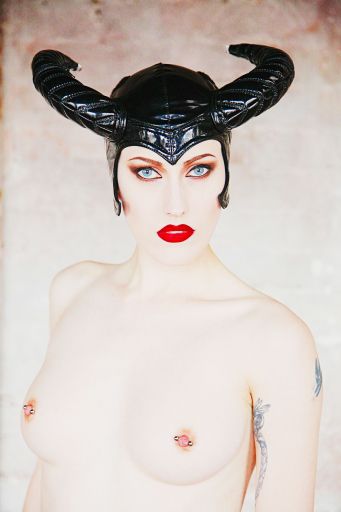
And now we have the exact opposite. I have increased the saturation of key elements and pushed the contrast at the extremes as far as I can safely go.
This creates an image which has almost no tonality except for the lips, eyes and headpiece.
There is just enough colour left in the nipples and some shadow under the bust to give a gentle balance to the picture.
You will note though when looking at the picture despite the obvious attractions of both the bust and the headpiece, your eyes are continually drawn back to the eyes.
That crisp, piercing gaze of Lucifer looking straight to your soul!
share:
This is an excerpt from "Anatomy of a Photoshoot" which gives a complete breakdown of two days shooting with a full in-depth step by step review of everything that I do.
It is available on Amazon
or on
the store