Critique for Adrian
Adrian was an attendee at one of our recent two day workshops we run in conjunction with the Royal Photographic Society (RPS). After every workshop a really useful part of the process is to send in some completed images for a critique. These images are from Adrian. Not all images have to be brilliant, sometimes it is the ones that got away that the instruction is most useful for.
Firstly, for all the images I am a bit concerned about the colour cast on them all. Shooting using the flash white balance on your camera should result in slightly warm images, but these look very warm. By shooting with a consistent white balance it is the same colour correction throughout.
On the other hand, if these look OK to you then you may have a colour calibration issue on your monitor.
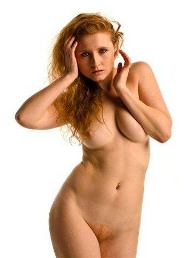
Lovely in every respect except for the kink on the waist and the slightly squashed boob. The general pose, crop and lighting are really nice for a high key look. I have a feeling you could lighten this up a lot more and it would look even better.
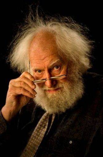
Love the mad hair!! This image is really close, but there's something just a little lacking in the expression, the looking over the specs is really good, along with the raised eyebrow, its so very close.
On a small note the button on the shirt is very distracting
Lighting is really nice.
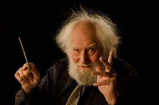
Terrific. Nothing more to add. Be interesting to see if this looked better with the eyes of camera, by having the direct gaze it looks more posed, whereas gazing off camera would have looked very natural.
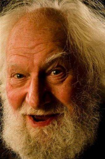
I like this, a good tight crop, a terrific look on the face, lighting is great. It's a little hard to tell with a small image, but it does look slightly soft. With a good face like this on a bloke you can afford to sharpen it even more than usual.
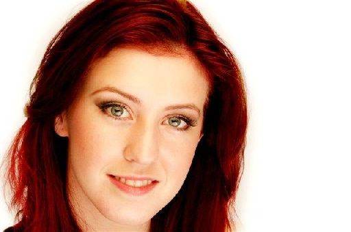
Good use of reflector under the chin has left very lovely eyes, but it's slightly too strong for my liking. I'm also slightly curious that the hair looks so dark. I would have expected more detail in the hair. The more I look at this the more troubled I am by the expression, I think the smile has just slipped.
I like the off-centre crop, adds a lot of energy to the picture.
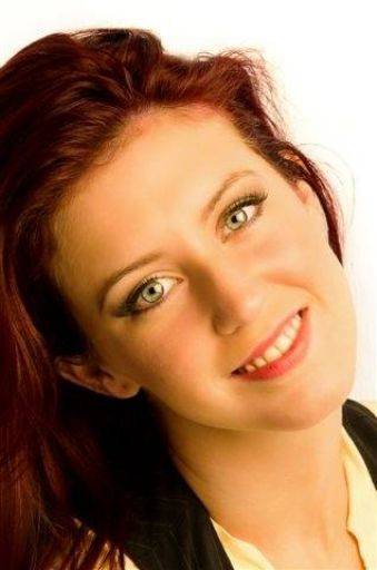
Firstly I would crop this 10x8. looks like too much space above the head.
This tilt is troublesome, the general rule of thumb is to tilt into the picture, rather than out in this case.
The tilt can add a lot to the image, but in the case the crop, the tightness on the right and the large space to left doesn't quite add up. The camera position is slightly too low relative to the face for this to really work.
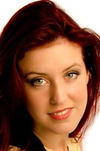
As above, crop 10x8, that would lose the top of the hair and move the eyes higher in the frame for a much stronger image.
I really like the catchlights, Harriett looks quite cheeky and happy at the same time.
As above I'd like to see a little more detail / lightness in the hair.
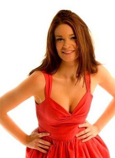
Good happy shot, but we're missing a little in the eyes, so the face looks a bit dead. I like the strong dynamic pose, normally you want the hips facing to the side of the camera, but this dominating position does need a square on pose.
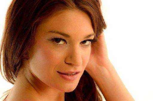
Very nice happy, cheeky, sexy all at one. Again I really like your off-centre crop, as in your earlier shot it really adds to the image. Nothing wrong with a good chunk of negative space at all.
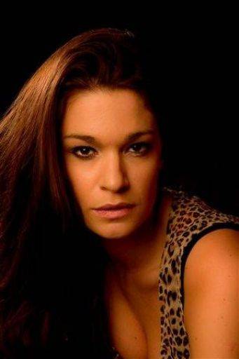
Nice low-key image, it could maybe have done with a little light on Brodie's shoulder and hair on the right hand side of the image. Under the circumstances I know why it's not there, but if you had more time on the shoot either moving the hair light or using a second rim light would make a big difference.
The face is slightly too left in the frame for me, I think it should be a little more central.
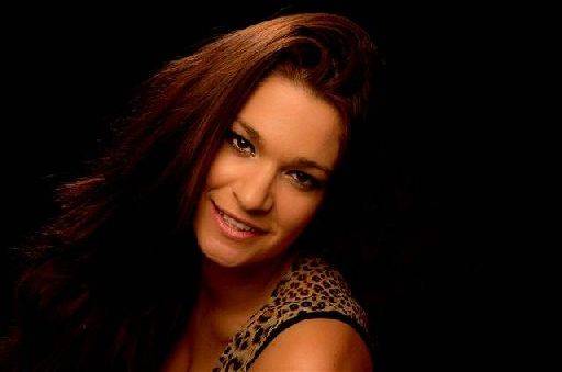
Where as this one has too much negative space on the right, try a horizontal 10x8 crop.
Otherwise again this is a really good low-key image.
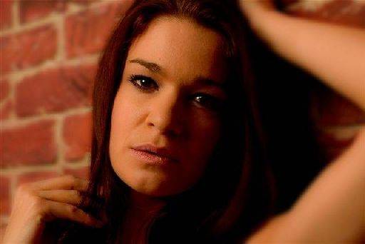
Nice use of depth of field, the soft arm on the right and soft brick work on the left work really well. The lights in the eyes are well seen and the way the light and shadow falls on the right side of the image is very nice too.
The crop is spot on, focuses on the face, uses the arm to frame and the fingers to add interest in the bottom left corner. Be warned though a camera club judge may be picky about the crop.
OVERALL:
Would be nice to see some of these as monochromes, I think some of them would be very good black and white, just watch the contrast when you convert, you may want to adjust the tonal range differently for mono.
Good, strong set of images, very well captured and framed. If these crops are straight out of the camera then you should congratulate yourself. Even if they are cropped in post production your sense of composition is very strong and to be commended.
share:
I run regular workshops for beginners and experts alike. I like to run a mix of styles and types. Masterclasses, portfolio builds, technical and artistic sessions available.
Current courses available.