Critique for Andrzej
Andrzej was a recent attendee at one of our Art Nude workshops. Post workshop attendees can send images for review and critique.
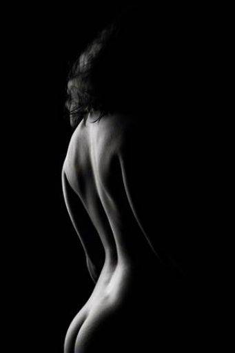
Simply gorgeous. Terrific lighting across the back revealing all the shape and form. Just slightly bright across the top of the hips. I think it misses a little hint of the front of the body.
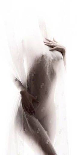
Sadly I'm bugged by the pattern in the net curtain, which I'm sure would photoshop out really easily. Other than that I love this. I like the way its mysterious.
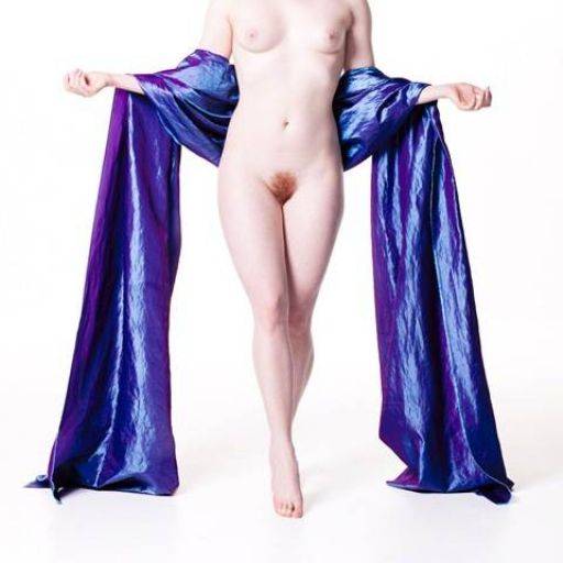
Smashing. Terrific use of colour, well brought out in post, the blue of the cloth versus the red pubes. The balance and symmetry is spot on.
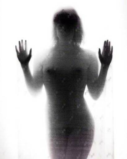
Ooh, this is interesting, a quite different look than the earlier curtain. Again the lack of clarity works really well. It has made the figure look a little fat and broad, for Artemis' sake I might tune that a little. Posing with a little more twist in the hip would have helped.
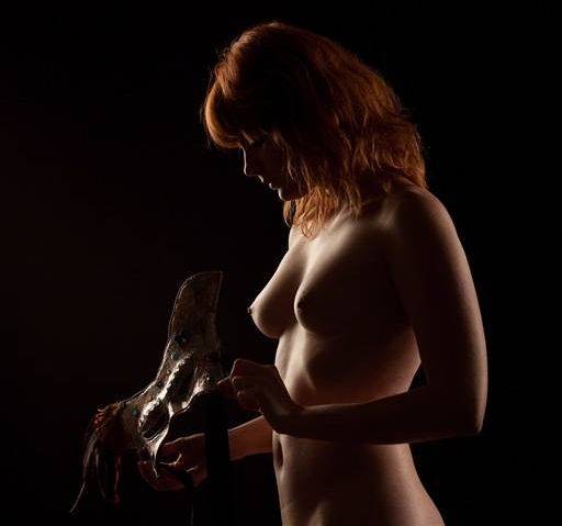
Smashing lighting, nice rim light but good fill across the front. Good use of the mask which probably works better here than on the face!
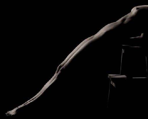
I understand why you've cropped it like this, but for me it's just slightly too close to the bust. A little more neck and arm would have made more sense of the image, whereas it looks messy. Not sure about the stuff in the bottom right not balancing with the negative space top right. I know where you coming from, but doesn't quite hang together.
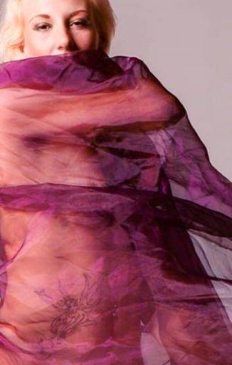
Not enough structure in this picture to really make it work, all the elements are a bit random, so instead of getting echoes of shapes, or pleasing curves nothing fits together. Crucially the eyes are caught mid blink and that is the end of the picture for me.
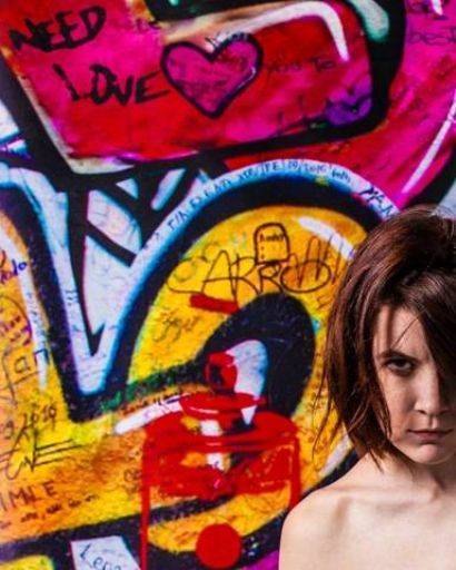
Very interesting crop, works well and makes a strong dynamic to the image. Sadly the light on the figure is a bit too square on and the way the hair hangs across the face has given Kirsty a "moon face", very round.
It looks a bit oversharpened, lots of artefacts in the hair, but that might be from resizing.
Shame, because at first glance I really like this image.
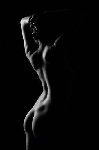
Nice rim light, but I'm not so keen on the softness in this image - I can't tell if it's a focus issue or a post processing technique. The odd shadow above the hips, caused by the hip socket is distracting. But more than that the skin tone on the leg doesn't look good. Finally the ear is too bright. Doesn't have the subtlety of the first image I'm afraid.
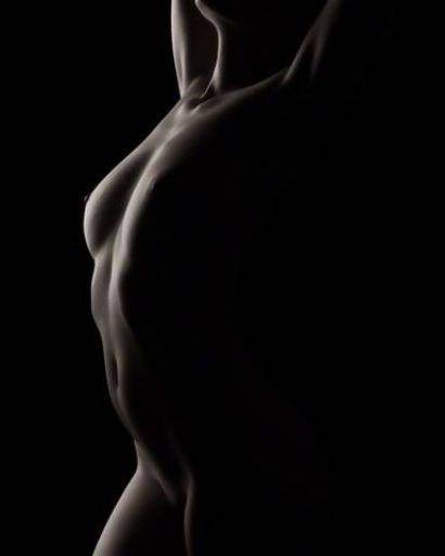
Better, but still a little soft. The crop is good and is a perfect example of using the light, just look at the way it comes and goes across the stomach.
Overall a good, strong creative set, much more interesting than many of the sets I see, I've been harder on you than others because when it goes well for you your images are very strong. Keep experimenting and don't let your photography be turned into something well executed but very average.
share:
I run regular workshops for beginners and experts alike. I like to run a mix of styles and types. Masterclasses, portfolio builds, technical and artistic sessions available.
Current courses available.