Post workshop image critique for Brian
Brian attended one of our Art Nude workshops. After every workshop photographers can send me images for a follow-up critique and review.
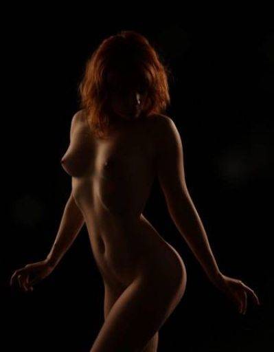
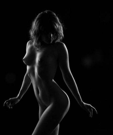
Same image, colour/mono and slightly different crop.
No doubt about it the mono is a much stronger image though the crop from the colour is better.
The rim lighting is perfect, revealing shape and form wonderfully. The post, with the hips angled away, bum out, shoulders slightly back to camera have given Artemis a very flattering shape as well as making the most of the lighting.
The arms in particular are perfectly posed, giving good separation from the body and again illuminated on both sides of the arm.
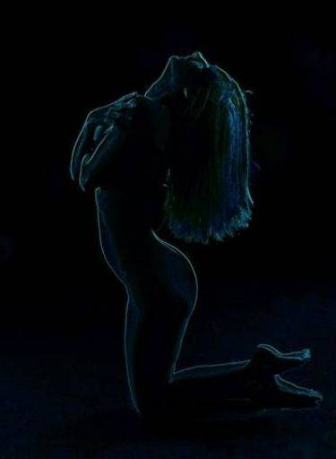
"Glowing Neon Edges" or some equivalent filter. The trouble is I've seen this treatment about 10 years ago and it hasn't improved. While it may have a novelty value to you to any photoshop user it's just passé.
But also, it can emphasise the wrong things - for example the feet are very bright and horrible.
I suspect the original image looks quite good because the pose is interesting.
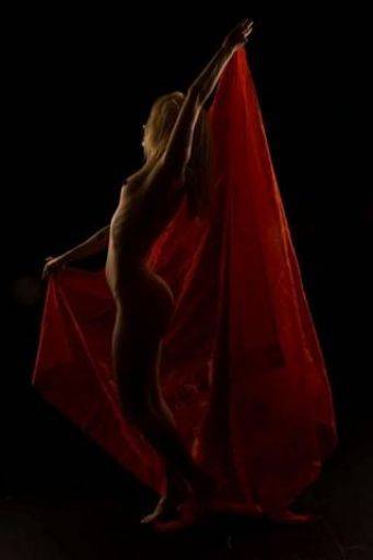
Underexposed I think, which means we've lost the vibrancy of the cloth and the overall image just looks a bit muddy. Probably easily corrected in post. Overall though I wouldn't bother :) There's nothing in the picture to give it any strength, there diagonal is off, the cloth looks floppy and unstructured.
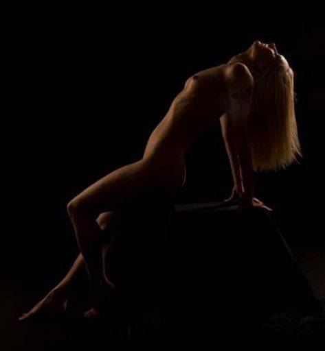
Very close to perfect classical art nude shot. Sadly it demonstrates that the devil is in the detail. See how there is no proper rim light on the back of the model, except for the bum, it really need to be all round. Also the arms and hands are neither placed together or apart, just a little messy. The model has done the right thing but your job as photographer is to pick up those details.
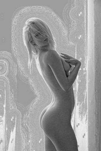
Fun stuff with post. Firstly Niki has come out perfectly, but the background instead of adding interest to Niki is instead distracting. I would swap it for a very simple white or grey.
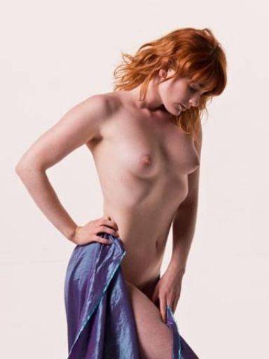
Terrific soft, gentle image, the colours blue and red complimenting each other perfectly.
The lighting though soft has still given a good sense of "3D" and roundness to the whole body.
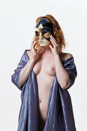
Slightly over exposed but probably recoverable in post.
The overall structure of the shot is very good: stable, controlled, peacefully yet disturbing.
The lighting is too flat, you can see it is flat into the subject.
You could try some subtle treatments on the cloth see if you can get a bit more glow and overall the same kind of saturation as in the previous image.
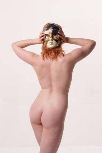
I love the idea of this image. These three things would help:
1) Move the lighting to one side - it's completely flat
2) Twist the hips more to the side for a more flattering shape
3) Fill the eyes of the mask so there is nothing distracting within them.
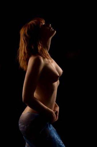
Lovely. To be picky the hands could have been slightly better, but this is just lovely.
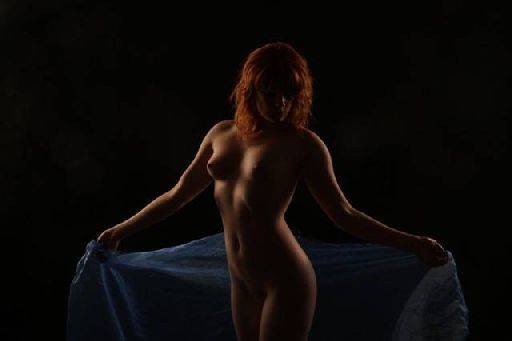
Not sure what's happened here, it's a little hazy and soft which makes me think there might be a little lens flare inside the camera or something. Certainly there is all sorts of flare spots in the black, though I like those :)
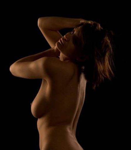
This looks like it was underexposed and recovered in photoshop, there's a lot of colour noise in it.
While this ought to be good it isn't, again because of a number of details
1) The arm poses don't properly echo or complement each other
2) The crease on the waist
3) The exaggerated tummy
4) The uneven lighting on the eyes
5) the lighting that shines UP the face rather than across or down
share:
I run regular workshops for beginners and experts alike. I like to run a mix of styles and types. Masterclasses, portfolio builds, technical and artistic sessions available.
Current courses available.