Critique for Carole
Carole recently attended one of our nude workshops with the RPS. All our students can send images to me post-workshop for a review and critique - a valuable part of the workshop process.
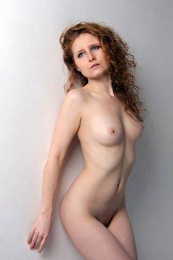
Blue eyes, red hair in an almost monochrome image. The creases on the neck should have been spotted on shooting and I would have liked the light to come in from the right hand side your camera angle to the light means its a square on. The pose and composition and framing are good.
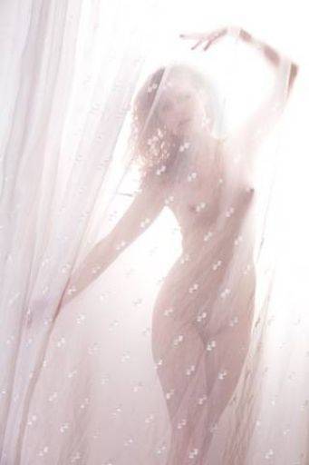
Like this a lot, very controlled lighting in a very high key set up looks gorgeous. The definition is very good, yet still holds mystery and wonder. It is a shame about the patterns in the net curtain, but too many to photoshop out :)
I especially like the way the hand on the top right and folds of the curtain on the top left give a good balance between each other and fill the otherwise bland negative space.
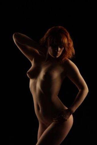
Very nicely executed. Good lighting control, just slightly missing rim light on Artemis' back.
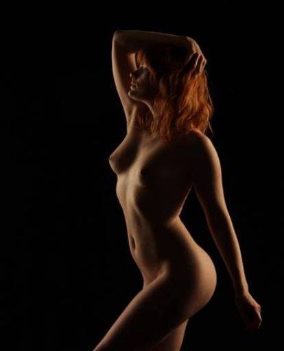
Whereas the rim here works very well. nicely balanced on both sides and gives a much more flattering and interesting shape. In particular the fact that the face is properly lit and separated from the arm behind it works very well and would have been easy to mess up.
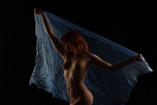
The cloth is fascinating - is this in camera or post? I'm going for in camera caught in motion and its terrific - especially the colours of Artemis complimenting the blue. Just clone our the spare threads - they are distracting.
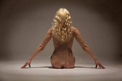
Close, but not quite. With a shot as simple as this getting it exactly right is really difficult. In this case I see a number of small details that make the picture not add up.
1) The waist is too thick
2) The elbows are wrinkly
3) The fingers are not quite symmetrical
All of those could be fixed by tweaking the pose
These have also combined with a lighting that has ended up over soft.
To be honest, you could take this shot many, many times until you finally nail the one that really works, so don't be disheartened - simplicity is difficult :)
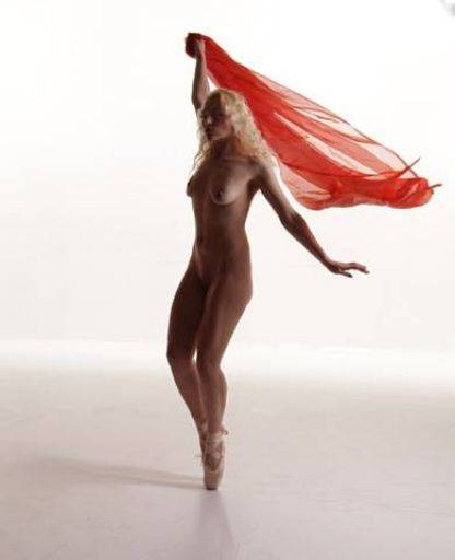
Probably the weakest shot in the set, there are interesting bits there, but it doesn't come together. It's neither static nor dynamic, neither contrasty or soft, neither in motion or still.
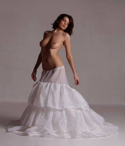
Lovely, good pose, good composition, nice lighting giving clear difference in all the white and grey tones.
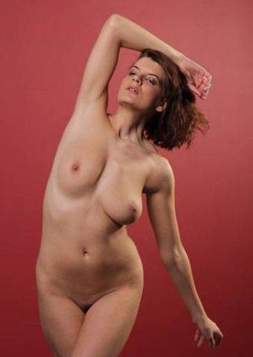
Too frontally lit, pose has made the boobs look very lopsided, eyes are "drunk", palm to camera, unflattering pose. This is the other contender for weakest shot. But in this case the reasons are obvious.
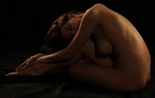
Warm, soothing, a difficult pose pulled off well, all the limbs are there but clearly separated and obvious which one is which - something that often goes wrong with this kind of shot. To me there may be a cool toned "sad" version of this image - from the same shot something warm and cosy, then cool and chilling.
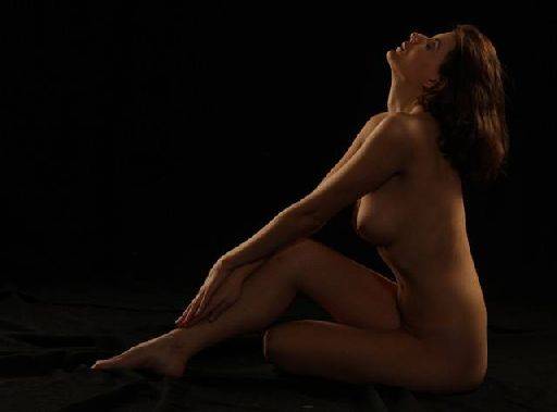
Probably shot just moments after the previous shot, again, very lovely, smooth, calm, serene. The lighting which worked so well on the previous shot is just slightly over bright on the fill at the front.
Also, touch up the bruise on the knee.
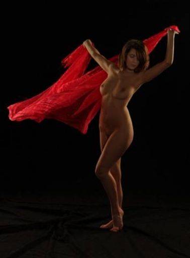
Shot too wide (camera too close, zoomed too wide) it has distorted the image.
It's interesting how the motion in the blue cloth works so well and here it's not quite.
What you could do is stretch the red cloth off the left hand edge and that would make a much stronger image.
The floor has "some" wrinkles but not "enough" Remember it must look deliberate. This looks more accidental.
I'm not quite sure whether this is soft - it may be an artefact of resizing.
Overall this is one of those sets which is so close, if you put them together as a panel and on a quick view they all look good, just when seen individually don't quite make it. You are very close, your eye is good, I can see that all the elements are there. I'm afraid you are now in the "practice, practice, practice" stage.
Possibly the biggest tip I can give is for each of the images you have shown me look at those that were similar that you did not select. Look for the reasons why you didn't choose them, and then apply those differences to go to the next level.
share:
I run regular workshops for beginners and experts alike. I like to run a mix of styles and types. Masterclasses, portfolio builds, technical and artistic sessions available.
Current courses available.