Critique for Colin C
After every workshop attendees can submit images for a final critique - this is a valueable part of the learning process.
These images were taken at our recent workshop with Ivory Flame at Image Red studios by Colin C.
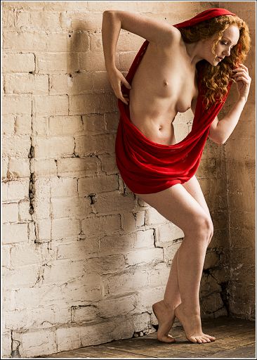
I think this is quite a distinctive image, but it does have some difficulties. Firstly in terms of post processing: the "clarity" or whatever process you have used to increase the contrast, is great for the environment, but not so good for Holly. It leaves the skin not looking as pure as it should. It has also made the noise on her legs very obvious.
The convention is for the figure to look into the frame, in this case the image at the right edge leaves a rather awkward negative space on the left. The dynamic in the pose doesn't justify the odd position in the frame.
I like the broken brickwork path that runs across the diagonal of the image. Getting Holly's pose to echo that line would strengthen the image. For example her bent leg is at a different angle.
I really like the way the red pops on this image, there is lovely rich painterly detail and tones in the red scarf. The way Holly's hair flows with the scarf works really well.
So overall, I want to like the image for its difference, but it doesn't come together.
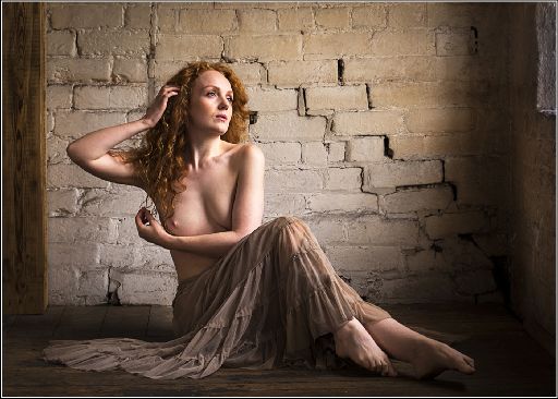
Same notes re clarity/sharpness as before.
The overall structure of this image is much stronger - see how the leg does track the brickwork now.
The gaze out of the window is good. I'm not sure about leaving the little sliver of window in the shot - I think it either needs more window or no window.
The highights on Holly's face are just a fraction to bright.
The tones across the body look great - and in the skirt as well - lovely sense of dimension to it all.
A very sensory image - you can feel the textures of the brick work, the skirt and the skin.
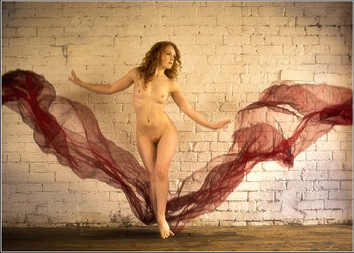
This is one of those "not deliberate" enough images. The hands are just a little blurred making it look more accidental than deliberate.
The colour on this looks a little wonky to me - a bit too green and yellow in the mix.
Keep an eye out for bright details in your images. Holly's foot is a little bright and the wall bottom right is too bright.
The timing is good, the mirroring of the arms versus the cloth is about right. Like a V reflected.
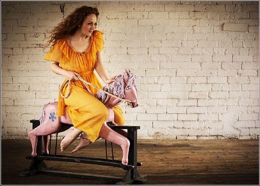
This has come out very well - I seem to recall you not feeling confident at the time, but I really like this shot. There is a hint of the surreal about it.
Holly's expression is good, the posing is almost perfect - look at the way Holly's leg lines are reflected in the horses legs, the rope, the arm.
I like the vignette, but you need to do a little work to bring the lightness back on Holly's face. Maybe drop the light a little on the wall.
Again your work to bring out the detail has been very good - but I would mask it off on Holly's face especially.
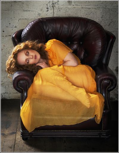
Very good. I'm going to be very picky here because overall this image is spot on.
The chair is not quite central in the frame - which once you see it is really annoying.
Holly's elbow - because it is brighter than dress, keeps dragging the eye. For this shot a full sleeve would be better.
I think to compensate I would have brought Holly slightly higher in the chair, the sheer cloth across the bust would be great. It would bring the whole arm into view which would make more sense and the arm could then be used to guide the eye back to the face.
I think the sheer cloth across the legs is terrific. Sheer materials can be so difficult at times and I think this is a perfect example of it working well.
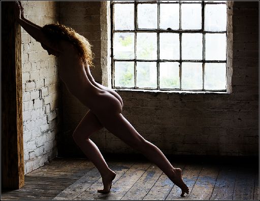
Darn it - this is so close, but what does for it is the lack of rim lighting on Holly's front.
The rim light on the forward leg is perfect - it clearly defines and separates the leg from the background. But as you move up the figure you lose that light and so the body and background tend to merge together.
The fingers top left are too tight to the frame - in fact the edges are cropped off.
Finally, the horizontals and verticals are not quite true anywhere in the image. Squaring the camera to the window wall would have helped. It is very likely that 1 good step to the left would fix 99% of all the issues in this image.
These are a good set. I do like your post processing work to bring out the structure and detail in the images. I've called it "clarity" for the sake of simplicity, you may be doing a range of things to enhance those details. You need to use it selectively though. That kind of sharpness and detail on a female form can be very unforgiven. Also, consider dropping it off at the corners - think of it as a softness vignette if you like. The eye is always drawn to areas of contrast, so by losing contrast at the edges you keep the eye focussed in the centre of the frame.
share:
I run regular workshops for beginners and experts alike. I like to run a mix of styles and types. Masterclasses, portfolio builds, technical and artistic sessions available.
Current courses available.