Critique for Darrell G
Darrell came long to our Nudes Amongst the Wrecks workshop with Ella Rose and Ivory Flame earlier in the year. The girls braved a chilly and windy day, but the weather certainly added a lot to the drama of the images.
After every workshop I ask for attendees to submit images for a critique and suggestions - these are Darrell's images.
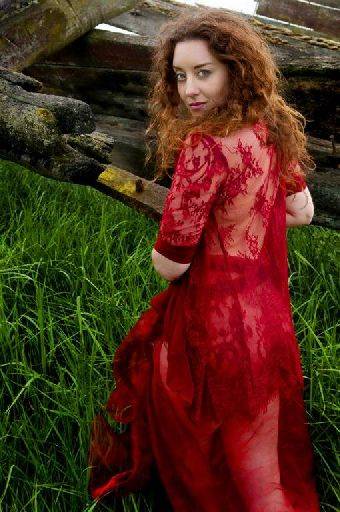
This will apply to a couple of the images but the sky can be over bright, burnt out when little bits sneak in like this one. The trouble is it gives a high contrast zone on the edge of the frame which draws the eye. You could either locally drop down to a grey, or in this case I would just clone in the woodwork to fill the fairly small gaps.
I really like the pose and over the shoulder look - it's not a comment setup and works really well here. Ella's expression seems to match the pose perfectly. Nice colour combination and some good separation of her lovely curly hair against the background.
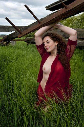
Normally I would be saying to shoot with a lower camera angle to reduce the amount of grass (or any horizontal surface) in the image. But here the green works as a perfect foil against the red drape and flesh tones. Nice hint of backlighting just gives enough separation.
I like the angles of the arm and the woodwork. You can finesse those angles to match up a bit more so they are all consistent in the frame you will get a stronger image.
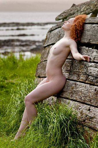
Well held backdrop and some lovely skimming light coming across Holly's body. The pose and positioning against the woodwork is very good. I think this would also make a great monochrome.
Just watch the light on the chest, it looks a little bright and might be toned down just a little. Smashing light on the face.
Also, importantly, the foot is still visible, so gives Holly something to stand on rather than being "cropped" off by the grass.
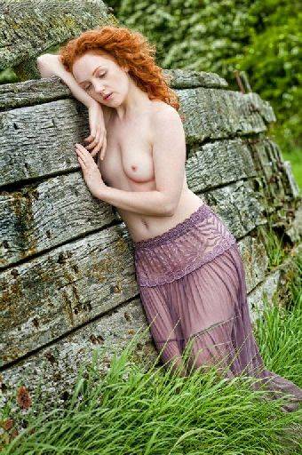
Overall a nice mix of tones and textures. It may not have been deliberate but the way the lines of the skirt match the lines on the boat works well. Holly's lean matches the other diagonal lines in the frame to give a strong composition.
However, the eyes are neither open nor closed and that really spoils this image for me. Eyes are the first thing anybody looks at and they have to be right every time.
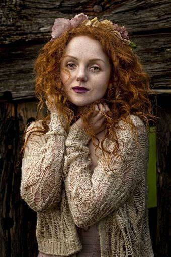
I like the darker feel to this image. Also, well done for bringing out Holly's freckles. This could be an over-sweet image, but the wind and the slight cool tone really makes this quite a dramatic shot. I would have probably warmed it up and lost the real appeal of this image so well done for keeping that cooler look.
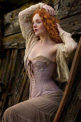
A good fashion pose, with the raised leg providing a good compositional base to build on. The hand on the top of the head is a little large and face to camera, better to poke the fingers into the hair. I like that the gaze is off camera, but the head is just turned slightly too far, giving an awkward cut of nose and eye - for most purposes you will get away with this, but a camera club type judge will pick up both of those issues.
I would like to complement you on your overall colour management. These are lovely saturated and colourful images and I really like that.
Exposure control has been good throughout. You've done an excellent job of maintaining the texture and detail of the old boats, but through good use of the colour you've managed to make them stand clear and separate from your models.
This is a very strong set, particular since I think this is the first time you have shot this sort of work
share:
I run regular workshops for beginners and experts alike. I like to run a mix of styles and types. Masterclasses, portfolio builds, technical and artistic sessions available.
Current courses available.