Critique for Dave
These are Dave's images for critique following the November workshop we ran in conjunction with the RPS.
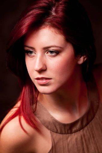
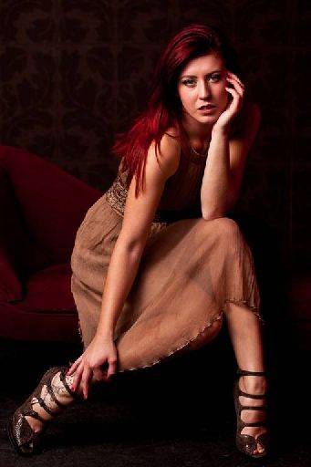
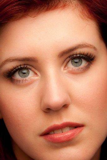
There's a red shift in these images. Can't tell if it was in camera or in post. It looks like the camera settings were not correct given a red bias to the images. If it was done in post deliberately then there's too much!!

I like this shot, very dynamic, strong powerful image. I like the curl of hair across the shoulder which cuts down the big fleshy space that would have been there. I think the ear is a bit bright and catchlights in the eyes are really needed to bring Harriett alive.

Terrific shape in the post, I hope that was more you than Harriett. It works because of all the contrasting angles and line, although they are all different - adding interest to the image - they still complimentary to each other, rather than fighting against each other.
Nice tight crop, the shoes look great, I like the hand shapes, though the hand bottom left is just acceptable,

This is so close, but the tilt doesn't work for me. I think as a close up crop on the face with the eyes horizontal would be much stronger. Lovely light in the eyes. That said, if the light had been another 12 inches higher - still keeping the catchlight, it would have given better structure to Harriet's face and stopped it looking a bit chubby.
share:
I run regular workshops for beginners and experts alike. I like to run a mix of styles and types. Masterclasses, portfolio builds, technical and artistic sessions available.
Current courses available.