Critique for Dave - Pinup Workshop
These are Dave's selected images from our recent Pinup Workshop in conjunction with the Royal Photographic Society.
Firstly I just want to talk about the post-processing. The whole point of this shoot was to achieve the "Petty" style draughted and painted pinup styles, so we're clearly not looking for something photographic here.
I think the processing is pretty good, there are a couple of places, particular on the faces where this is a little too heavy, it's dropping to much shadow into the image, but overall I like it and it's very appropriate. I would also look to see if you could introduce more colour/saturation, without affecting the skin tones.

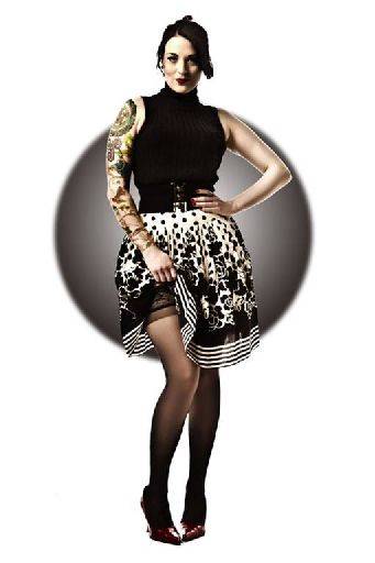
Cracking shot, love the background circle, especially the way it fits around the shoulders and hem of the skirt. There are some wrinkles around the torso that could do with cleaning up. The rim light has worked really well to separate Tefnut (our model) from the background. You could make her legs a little longer and cinch the waist a little.

A bit dark, I suspect from the post processing. Just try dropping in duplicated layer with the blend mode set to screen. The uneven tones in background could do with sorting out. Chair legs are a little messy - there seem to be a lot of them!

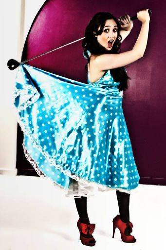
The post on the face is too intensive. Really the whole background needs replacing with something green to reflect the golf setting. Pose and crop are good - though maybe a little tight. This is shot too wide angle for me. Needed to be taken from further back.

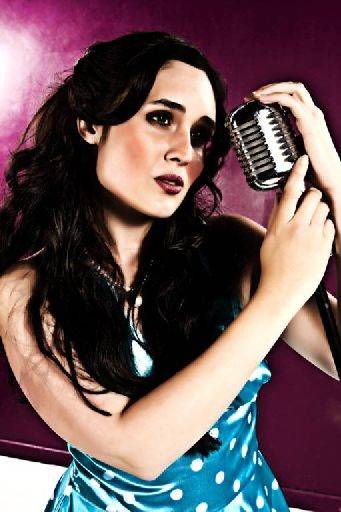
Post has really blocked up the face, you should be looking for very smooth tones across the face, but here the eyes have gone way too dark and we've lost the far eye all together. The background ought to be complete at the base of the image - the white is distracting A little finesse on the hands would have made them look nicer (turn them more edge on).

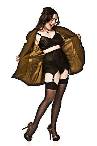
Perfect shot, just slightly dark on the face, otherwise terrific.

I understand where you are coming from with the toning, but it leaves Leah looking a bit murky, try a slightly different tone or reducing the tone on Leah. Otherwise, spot - on.
Overall, really nice set, perfect to the theme, poses, style and so on work very well.
share:
I run regular workshops for beginners and experts alike. I like to run a mix of styles and types. Masterclasses, portfolio builds, technical and artistic sessions available.
Current courses available.