Critique for David
This is a critique of David's images taken at our Portaits, Fashion and Nudes workshop run in conjunction with the Royal Photographic Society Digital Imaging Group.
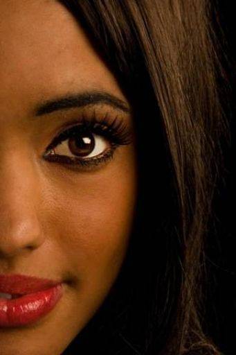
Very intelligent crop really highlights Natasha's face, lips and eyes. You could probably add a little (just a little) more light in the eyes and this would be perfect.

Very interesting crop but I think the eyes should be more level, the right and eye is too close to the edge of the frame. Like your thinking though.
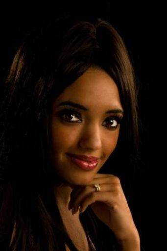
Lovely portrait. You could add a little light to the hair, but lovely.
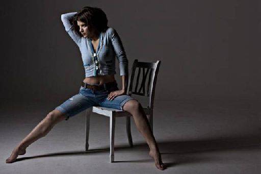
Very interesting crop again - normally you want the sitter looking into the frame, but looking out, combined with shape of the pose and the shadow to the right leaves a very strong and dynamic image.
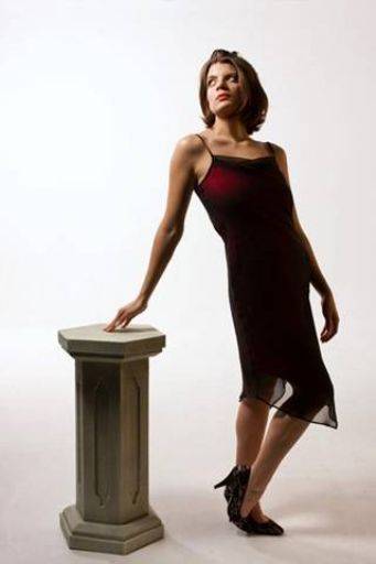
This is close, but... It's been shot with too wide an angle, a longer focal length would have improved it no end. Also, the angle of the hip has left a very awward body shape, no bust, what looks like a pregnant tummy but isn't. You've positioned Niki-Marie perfectly in the light and love the collar bones.
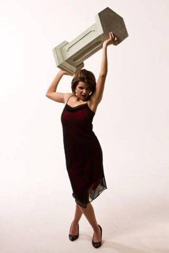
As above, needs a longer focal length. I like the thinking with the pose but the pose of the legs seems at odds with the upper half. Crop the bottom half of the image away and you may be closer. However, the light on the face has not worked well and the expression has moved from genuine emotion to a posed emotion and that kills the shot for me.
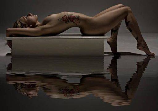
Nice image to begin with and a very effective treatment that's been handled well. While it's much more fiddly I would have taken the water further behind Nikki, almost half way to the horizon, then masked out as required. The crop is a bit tight all around, especially at the top.
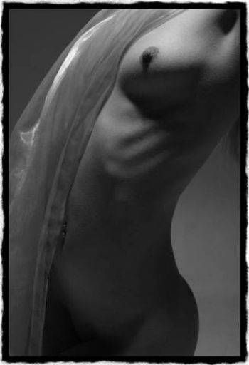
Smashing. Be careful with the "arty" frames - they can look cliched, but lovely image.
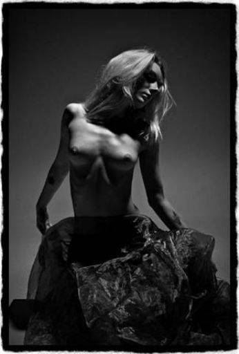
See, I'm bored with this frame now and it detracts, distracts from a stonking image. The monochrome, the contrast, the post, the cloth - smashing. The lighton the upper torso is great and although potentially awkward on the face actually works really well.
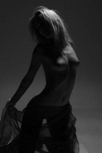
This is slightly to dark and too compressed in contrast down at the dark end. A slight lift in the mid to high tones would bring this picture out a treat. Great pose, shapes, structure to this image. I would also clone out the distracting corner of the box in lower right.
share:
I run regular workshops for beginners and experts alike. I like to run a mix of styles and types. Masterclasses, portfolio builds, technical and artistic sessions available.
Current courses available.