Critique for David
David was an attendee at our recent two day workshop on fashion, nudes and portraits that we ran in conjunction with the Royal Photographic Society. After every workshop we invite attendees to send images for review and critique, which is a very important and valuable part of the workshop process.
This is David's review.
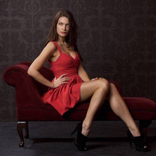
Nicely handled and largely right, but the devil is all in the details here. Firstly it looks like it was shot to wide, there is exaggeration around the hips and hands to me.
Secondly, the image is shot with the camera too high - that coupled with being too wide means that there is a lot of rather unpleasant floor in the shot.
Next the hands are not as good as they could be, Brodie's right hand is to hard with the flat back to camera and the left hand just has some odd finger ends poking out above the leg.
The eyes are away from camera, giving the "mad eye" look, eyes need to follow the nose, or look to camera, but never away.
The crease in Brodie's armpit is a bit harsh
The glare on the leg of the chaise is distracting, as is the toe poking out on the bottom right.
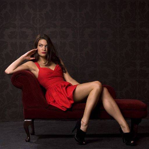
The hands are better, but apart from that everything about the first image applies to this one.
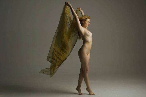
This is very nice, like the pose, shadows, positioning the vignette effect, smashing shot.
I have a feeling it would be stronger if the left edge was cropped out, that would make the image more dynamic and less "windy"
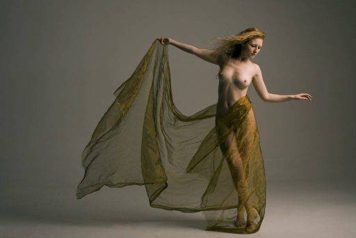
Another smashing shot, same comments as above.
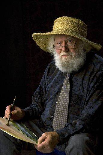
Nice portrait, again this is a little wide, but I don't mind that here because it gives a nice exaggeration of Dennis' hand. Crop, pose, light are all very good.
This is all in all a good image, my big trouble is that the dark low-key style doesn't quite fit with the sunny hat :)
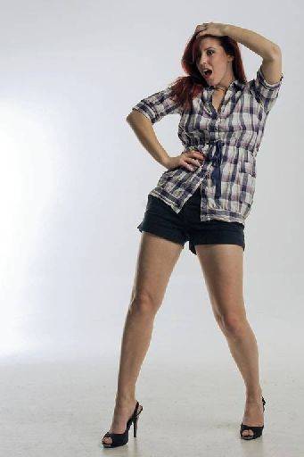
Still too wide. Very good pose and expression, shows of Harriet's legs perfectly and is a really good fun shot. I would look at brightening the whole image and making sure the back wall is completely white.
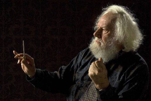
Very close, but again details let you down. The baton is slightly too low, needed to be pointing more vertically and the face is not quite a precise profile, that hint of the far eye is distracting. Otherwise very good.
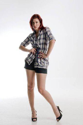
Very good, everything works here, just tweak up the back wall to white.
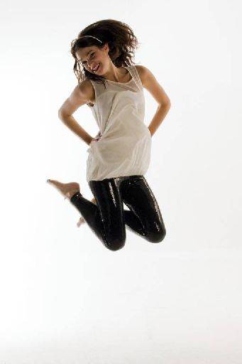
The whole image is a little under-exposed.
The trouble with these shots is that pretty much everything has come together perfectly except the top has fallen slightly oddly giving a peculiar swollen hip. You may be able to Photoshop this. There are lots of things to be picky about if this was a dance shot, but as a fun, lifestyle shot it's as it should be.
OVERALL:
Nice set, when the details come right the images are very good. The overall capture quality is good, but you need a bit of focus on the details. I know it's not straight-forward at the best of times and especially difficult in the group settings, but more attention to detail would have made this a very strong set.
I'm a little concerned about the backgrounds not being a crisp white, not sure whether that is a capture problem or a post processing problem, if I had to guess I would say they are under-exposed, but it is possible the lighting ratio between the subject and background wasn't correct.
It's only the wall part that should be white, the floor needs a hint of tone, otherwise the subject will just be floating in the middle of nothing.
share:
I run regular workshops for beginners and experts alike. I like to run a mix of styles and types. Masterclasses, portfolio builds, technical and artistic sessions available.
Current courses available.