Critique for Dennis
Not sure why, but I can only open a few of the images Dennis has sent for review.

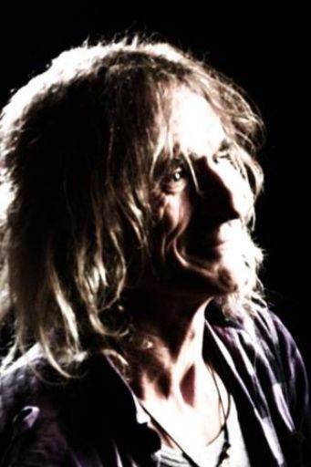
Very soft and over exposed in the highlights. Given that Jon's whole face is about craggy lines this is the opposite of what I would have aimed for,

The crop here is odd, too much white space to top and left, you really want the eyes one third down the image.
The lighting is too low, so it's almost lighting up the face, it needs to be much higher.

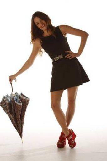
Good fun shot, lovely legs and shoes :) Crop is too tight and has nicked the corner of the umbrella.
I think the light must have been very low to the floor because the face lighting is all wrong and too dark

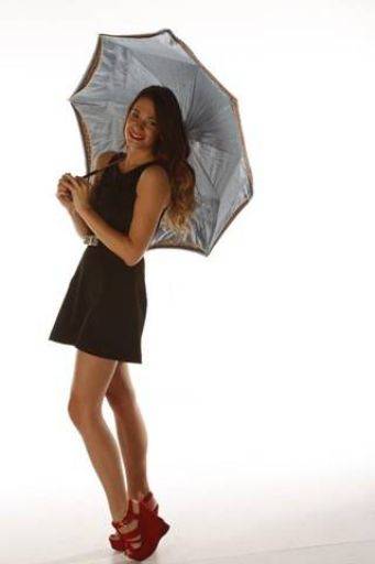
Same as above in almost all respects.
Crop wise Brodie needs to be on the right of the frame with the white space on the left, so the figure is facing into the frame not out of it.
share:
I run regular workshops for beginners and experts alike. I like to run a mix of styles and types. Masterclasses, portfolio builds, technical and artistic sessions available.
Current courses available.