Critique for Dick
Dick attended one of our recent Art Nude workshops. After every workshop attendees may send me images for a follow-up critique. This is that review.
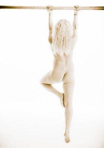
I see where you are going with this treatment, but I think the strength of the pose deserves a stronger contrast to compliment it.
I would use liquify tool the waist on the left hand side, just to tighten it up a little.
Lastly, it needs more space below the feet to emphasise the height of the hang. It looks like she is standing on tiptoe.
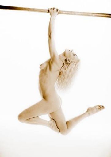
Contrast works better, but I would still look for a crisper, contrasty straight mono for this shot.
Biggest issue is the tilt in the bar. Straighten it up.
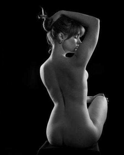
Very nice classical art nude shot. Nice lighting, good rim shot and fill light. The crop is off-centre and it ought to be central.
Biggest issue is the hand on the knee and the fingers just sticking out.
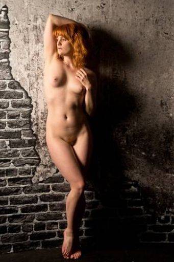
Nice us of colour against the mono background. Just fix the crease on the waist
Shame the background on the floor has gone wonky - may be fixable with liquify tool.
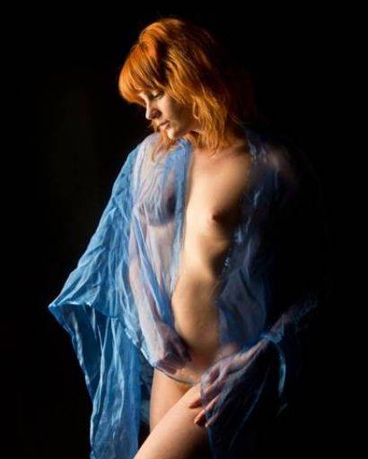
These colours, the blue and red against each work so well together.
It's a little overlight on the chest and thigh, maybe a little localised toning would help.
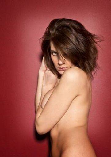
Terrific strong image - the red is not a normal background colour for portraits but here it adds such wow.
The strong gaze to go with the colour scheme is terrific. The trouble is that squashed up boob. You can't fix it in post but should have spotted it while shooting.
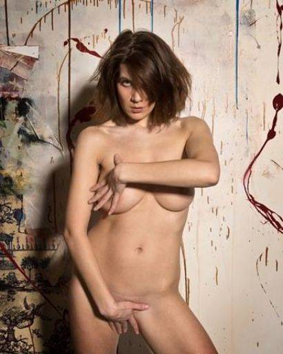
Assertive, strong "fashion nude" pose. Nicely separated from the background. Could have done with the light more to one side, as it is the light is a little flat to Kirsty. She has a frown which could be cleaned up as also the crease above the pubes.
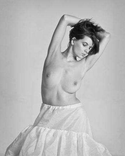
Really nice mono capture. The relative softness in the tones does not quite gel with the hardness of the pose, maybe just a little more contrast, especially in the shadows on the body and skirt if you could.
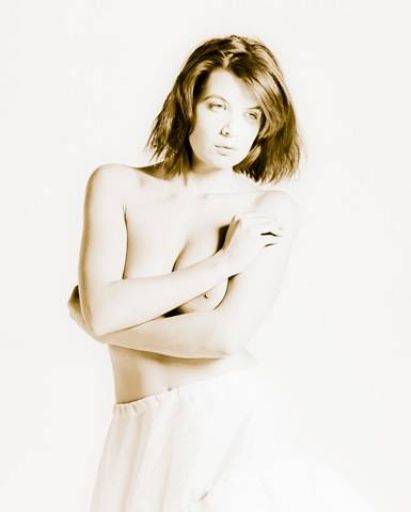
Treatment is interesting, but it's left really disturbing eyes which ruin the shot.
With this kind of very high key look you need to make sure you keep definition and separation, in this case down the right hand side of the image.
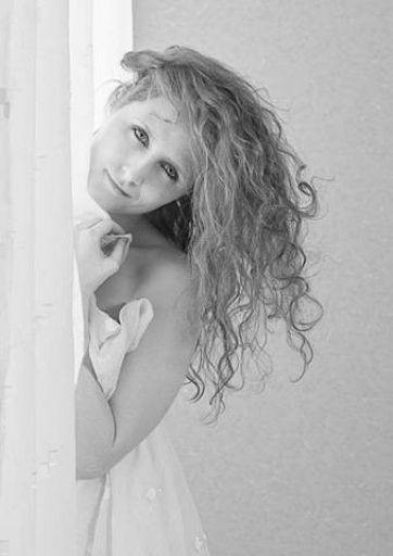
Cheerful, happy and teasing - I like this shot and the expression.
Shame that the pose leads to the light looking up the face, but there's nothing you can do about it with this shot.
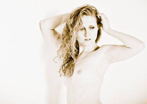
Really nice treatment, here the adjustment to levels to push it up very high key yet keeping the shadows and definition has worked very well.
The warm tone is a bit too warm for me, turn it down a bit so it is just not quite black and white.
You could crop a little more off the bottom of the picture, because this leaves the image a bit "windy"
Good set overall, like the idea of the treatments, you just need to back them off a little so the treatment is more subtle. Good eye and good selection.
share:
I run regular workshops for beginners and experts alike. I like to run a mix of styles and types. Masterclasses, portfolio builds, technical and artistic sessions available.
Current courses available.