Critique for Graham
After every workshop, whether through the Royal Photographic Society (RPS) or privately, attendees are invited to submit images based on the workshop for further comment. I always hope to provide information suitable for the individual and for others readers. If you are interested in attending any future workshops, please contact me sqw @ FilmPhotoAcademy.com

OK, I'll be honest here - this prop I have never successfully got a standing posed shot I like with it. It looks great - looks like it ought to be interesting - just never works for me. I quite like the way you've posed Cat on it, especially the foot on the base. It could have done with a bit more contrast in the lighting I feel.
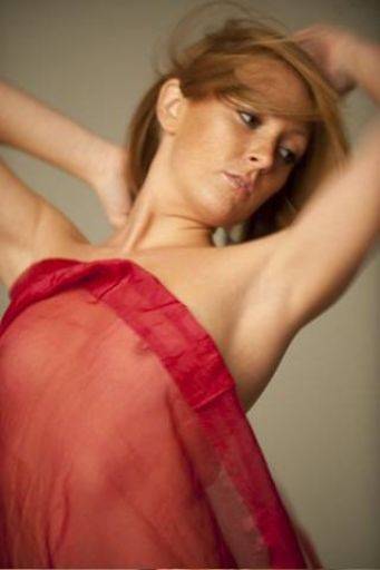
This I like. The movement is terrific yet the eyes still look sharp. I think this would be stronger as a monochrome image. I also wonder if you could crop either a little or a lot of the bottom - the bottom half of the image is nothing like as interesting as the top half.
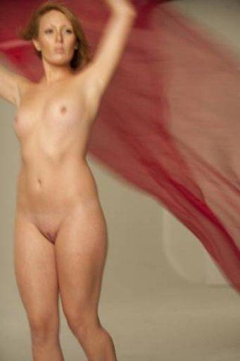 Same as above, the bottom half is solid, static and not very flattering really. You could lose half this picture and have twice the picture as the result. I love the positioning of Cat right at the edge of the frame.
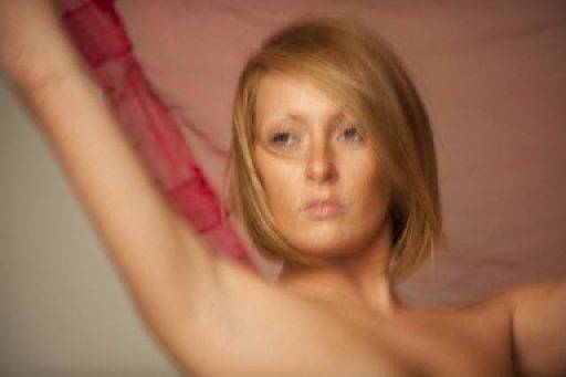 This crop is so much better, stronger for being closer. It's hard to say on these reduced size images, but for me the impact of the motion isn't the same here as on the previous two. Crop the other two like this one I reckon. Again I think monochrome could be interesting. Capturing images with blur, just enough blur, not too much, is difficult at the best of times. Sometimes its fine to have the whole image moving, sometimes you just want some of it to move. In the earlier shots, the arms are giving plenty of action and the head is relatively still and I like that.
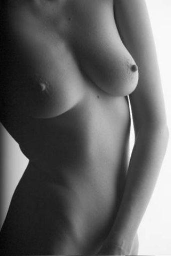 Nice monochrome, love the way the tones wrap around the body. I've got two tweaks that would help: (1) clone out the moles - they are distracting, (2) with the wrap tool (or whatever its called) that little push of flesh needs straightening out. There is also a potential issue here with the hand. It could be read as the model playing with herself - to put it bluntly. Now, there's nothing wrong with that, but be aware not all viewers will see it the same, some will see it with innocence, some with shock, You know the reality because you were there, but your audience may not. That's one of the reasons coming back to images after a month or more lets you see them fresh. This kind of gotcha is also a good reason for having other photographers critique your work - because they will see what is in the image - not what was at the shoot. None of this makes it a "bad" picture - indeed it may indeed add to it, but it is something to look out for. Notice the hand position in the next image doesn't have the same problem.
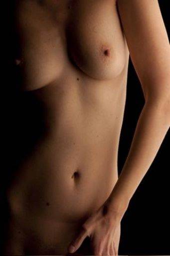 I like the crop across the knuckles. Normally you would say that's absolutely not the place to crop - but this makes it a picture about the hand which I think is really quite clever. Lovely glow on the body. Moles need zapping. If you don't want a picture about the hands, crop it above the wrist - you've got quite a few options. You could also crop a fraction more off the right hand side just to make the crop look a little more deliberate.
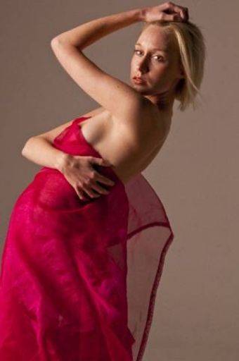 I don't like this one. "Like" is of course entirely subjective. I think the expression, light and particular shadow on the face look wrong to me. There's too much white in the eyes. And in the picture overall I don't think there is a balance to the blocks of colour, but they are not in-balanced in a pleasing way. Sorry, that all sounds mean and nasty, but I don't like this one.
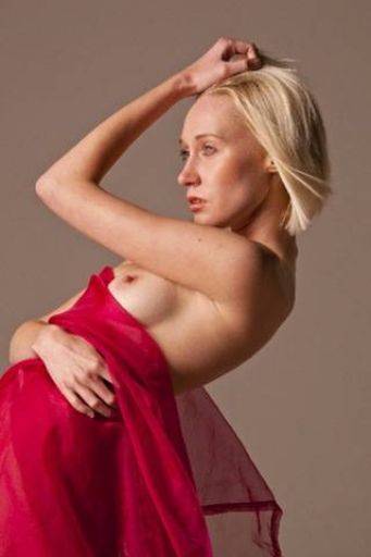 Whereas this one works much better. The lighting, expression work better together on the face. The arm framing the face is cool. The amount of red is more balanced in the image as a whole, the awkward pose can be seen for what it is. Again, clean up the moles on the arm. I'd also want to crop just a little more red out - the red is such a dominant colour and its still not quite balanced right I think. One thing to watch for is that with the arm framing the face like that you do get a picture of two parts - inside the arm and outside the arm. That can often split the picture.
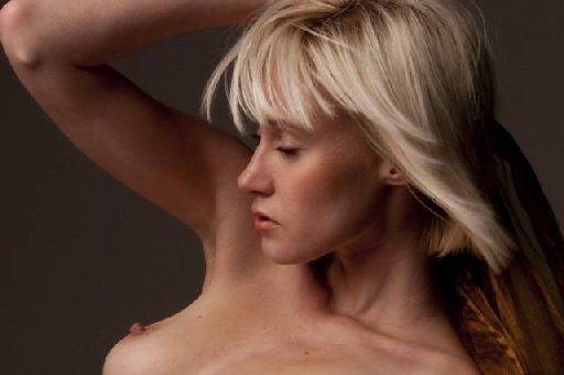 First off, crop out that bit top left corner. If you've got a bigger frame of this uncropped then I'd look at the angle of the crop - what I'm looking at is the arm running along the top of the frame - I think it needs to be parallel to the frame to strengthen the image. I like the eyes closed. Think this would be strong monochrome.
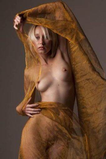 Terrific image. The cloth frames within the frame, the hands are perfectly "just revealed", the curvy shapes, the overlays of the cloth layers. Lovely.
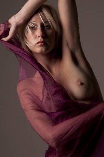 As you know all colours are loaded with pyschological overtones - purple is imperial - which is nicely reflected in the face. I can't decide about the crop - and I think its because you haven't been decisive in the crop. The knuckles top left are cut off - should they be in or out? The elbow at the top is decisively cropped and is fine. The hand on the right is cropped right on the wrist and gives that amputee look.
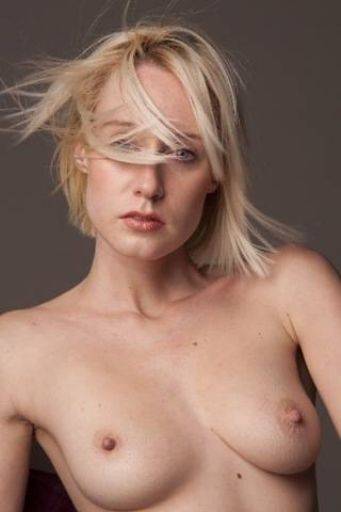 In colour this is too much like a glamour image that' doesn't have a smile... The flat lighting is more glamourous in its look as is the full-frontal approach, The flow of hair is terrific. I think this either needs to monochrome, or you need crop the breasts out - in fact - I would suggest getting the eyes absolutely vertical, then cropping really tight but quite wide across the face.
share:
I run regular workshops for beginners and experts alike. I like to run a mix of styles and types. Masterclasses, portfolio builds, technical and artistic sessions available.
Current courses available.