Critique for Guy
Guy recently came in for a one day 1-on-1 tuition session working with Julie Waterhouse who is an excellent dancer. This is the first part of the review where we were working on portrait images.

Good thoughtful pose, nice light in the eyes. This has been shot into the "broad" side of the face, the side of the face which is lit, this gives quite a large patch of light skin, it would be better shot into the darker side which gives a better shape to the face (called the "short" side).
Not sure about the treatment, both in colour and the vignette. I like the subtlety of it though.

There's a bit of a red colour cast to this, which makes Julie look more than just "warm-toned" The pose, angle, position etc are perfect - very workman like portrait.
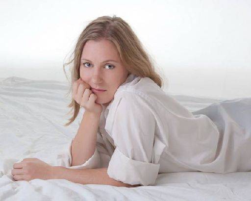
Not sure about the face - it's sort of somewhere between bored and somewhere else. It does have a ambiguity about it which I like, but I think the first impression is of boredom. The pose is good, nice framing and composition. I'm not happy with the hands which are a bit curled and fisted.
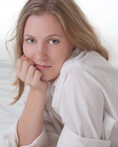
A little more cheeky in the close crop of the same image, she looks less bored close-up. This is a stronger image for being closer (the old rule the closer you are the better the portrait). However, this doesn't help the hand.
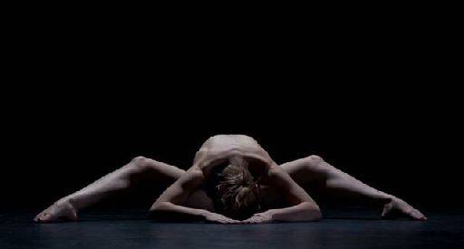
Smashing. Possibly just slightly too low-key, I think the figure could be a little brighter and I'm not sure it's quite level. Lovely.
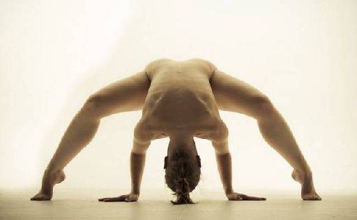
Personally I don't like the colour tone on this one, but that is just a matter of taste. If this was mine I would remove the pony tail as it just looks odd. There's some odd tone or banding in the background top left and right - I think it needs smoothing out. Other than that the symmetry is lovely, the pose is really interesting and exciting, the light falling on the torso is fascinating. Absolute corker.
share:
I run regular workshops for beginners and experts alike. I like to run a mix of styles and types. Masterclasses, portfolio builds, technical and artistic sessions available.
Current courses available.