Critique for Jane
Jane recently attended our October Weekend Workshop - a two day intensive workshop with myself and Graham Whistler from the RPS covering all aspects of portraiture, nude and fashion photography.
Any attendees to my courses have the option to submit images for critique and follow-up and these are Jane's images.
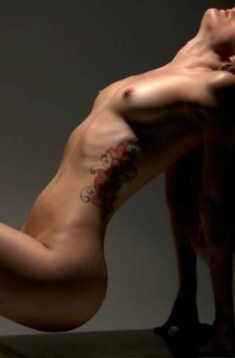
Love the composition of this image, the way it curves through, the framing with the arms, the cut across the face, it has a wonderful S curve symmetry about it which I think is terrific. The graduated light on the background is great - a good example of contra luminal lighting, it's lightest where the figure is darkest and vice-versa.
Two minor things: the light on the upper chest is a little bright for me, and there's something odd happening near her ear/shoulder.
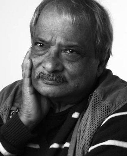
Smashing portrait, has a nice traditional feel, very appropriate for the gentleman. It does look a shade dark
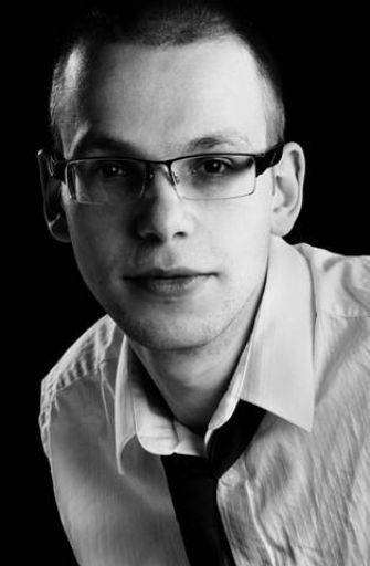
And conversely something much more dramatic for a younger model. Exposure, detail, angle of pose, all of this really comes together - very good.
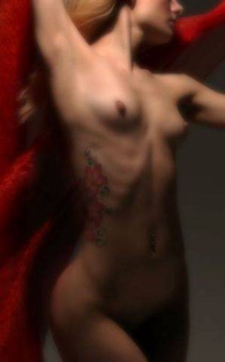
I'm less convinced about the crop on this one - I think we are missing Nikki's hair which with this treatment would have looked terrific. I think also it could be slightly lighter in the lower half of the image.
Overall though I like the way this is handled and the post processing softness - definitely a "pleasing lack of definition".
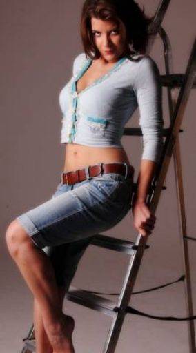
Good dramatic and vibrant both in the colours, tonality, pose and face of Kirsty. Nice combination of all the elements. I have reservations about the crop, maybe a little more space on the left and I feel the crop across the feet is a bit indecisive - cropping higher up the log would be stronger.
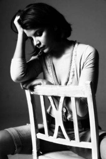
Nice, deep contrast black and white. It's very slightly too bright on the cheek and upper chest and chair, just a slight tweak to bring down the very top end of the whites and this would be spot on
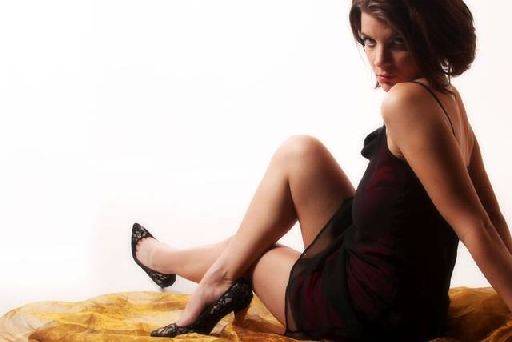
Probably the weakest of the set, I quite like the shape and pose, but the floaty material gives an odd shape and overall it feels too dark in the shadow areas.
On the one hand I like the thinking about the large negative white space, but on the other I think it weakens the image.
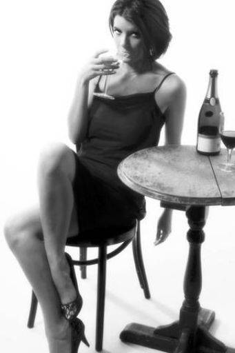
Shot too wide angle, needed a longer lens and a higher step ladder ! Like the overall feel and the use of the props has worked well here - even though its clearly a white studio set, the elements do fit together.
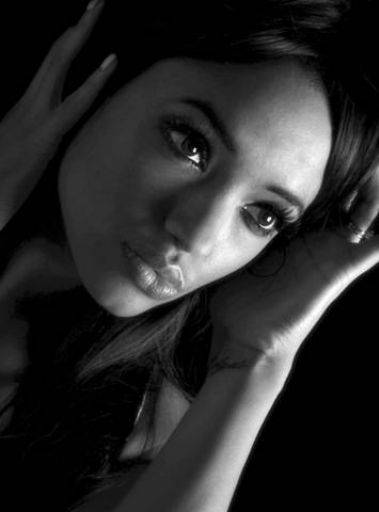
Lovely. Perfect light across the face, the placing of the hands is good. It's just a little light running down the arm and it makes the arm over dominate in the image, either crop it or tone it down.
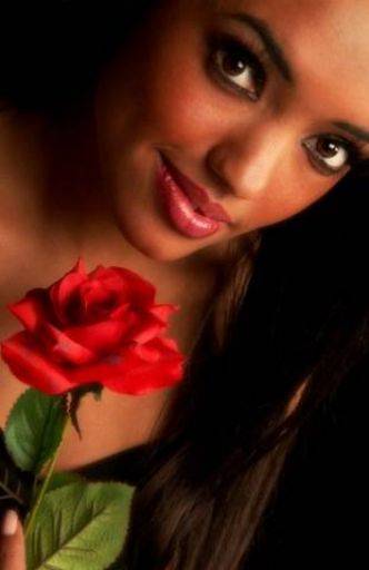
Looks slightly dark to me, though it has a lovely richness in the image which is smashing. Don't like the spare finger bottom left and there is a distracting patch of skin on the right hand side in the hair (her shoulder?) Again the angle is really interesting and makes for a dramatic view.
Once again Jane this is a terrific set, I wish you were more confident about your shooting because you really should be - your work is always strong, powerful and well executed - you should be proud of what you accomplish and be confident about it when you shoot.
These images have a wonderful sensitivity to the subject, showing them in creative ways but never over-board with the drama - always just adding to the image to create a real strength.
Terrific work.
share:
I run regular workshops for beginners and experts alike. I like to run a mix of styles and types. Masterclasses, portfolio builds, technical and artistic sessions available.
Current courses available.