Critique for Janet
Janet attended our recent two day workshop in conjunction with the RPS. After every workshop attendees can have their images critiqued, which is a valuable part of the learning process of the workshops.
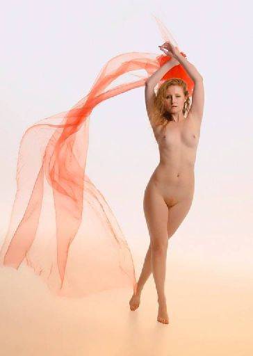
There's a really strong orange cast in the floor which I suspect is due to not having the camera settings correct, probably the white balance on the wrong setting.
Love the shape, pose, crop, flow of the cloth - this is very good. Try a tighter crop to the right, this may add strength to the image.
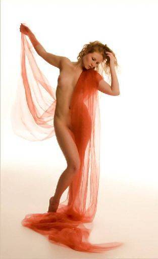
Again very good, I think I would crop into the cloth on the floor and/or build it up in Photoshop, it just sort of peters out. The shapes and crop are good. I'm not so happy about the cloth over the hand top left corner, the hand would have been better being uncovered.
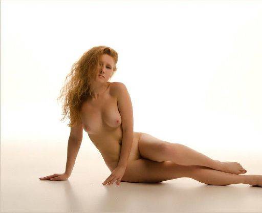
What happened to her toes!!! This is where you can't crop. If you want to keep the image (and the rest is good) then crop mid-calf and lose a lot off the top and left.
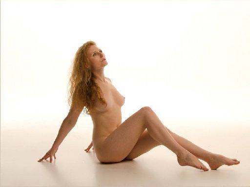
Nice delicate image, makes the most of Sharon's legs and hair. A bit windy top and left, crop it in a little bit.
The following shots of Brodie all suffer from the orange cast and being under-exposed.
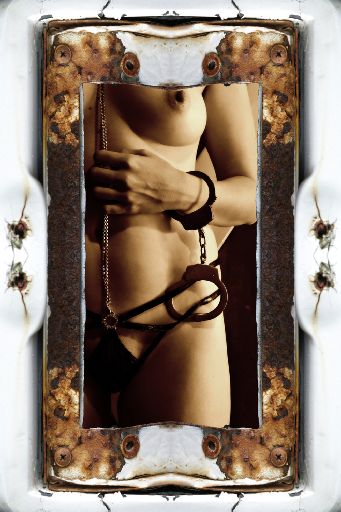
Correctly cropped to square to be a CD cover, though the text went wrong ?!
The pose sadly gives a terrific shot of Brodie's armpit, otherwise I like it.
If I was doing this under commission (instead of in 30 seconds) then I'd do this.
1) Light Brodie from the right of image, but the background from the left of image so it is darker in front of her face, but lighter behind the hair.
2) Added a hair light to make the most of the hair.
3) Experimented with the post to avoid that armpit, but also simplify the image
4) Be careful about crossing points, for example the microphone just crosses into the arm.
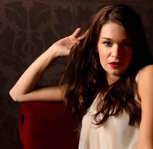
This is much stronger if Brodie were a singer this would make a better CD cover.
Could do with just a fraction more light on the dark side of the face and the palm to camera is a shame.
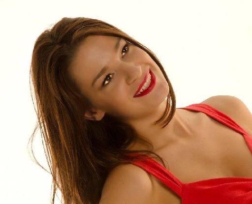
The eyes are way over brightened - she looks like she is lit up from inside.
The background should be white (as below) and the skin tones are too dark - adjust the whole image to match the tones in the next image and it would be better.
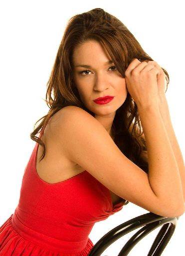
Lovely, moody, sultry, attitude, expression, emotion, atmosphere.
You might get ticked off for cropping the edge of the arm, though that doesn't bother me here.
I like this image.
OVERALL
Colour casts and exposure problems mar this set. The girls should have a warm tone, but these are positively orange. If it is done in post then it's too much. They are all under-exposed a little or a lot. Which again may be a result of post processing.
The posing, shapes, crops are good and strong.
share:
I run regular workshops for beginners and experts alike. I like to run a mix of styles and types. Masterclasses, portfolio builds, technical and artistic sessions available.
Current courses available.