Critique for Kate
After every workshop, whether through the Royal Photographic Society (RPS) or privately, attendees are invited to submit images based on the workshop for further comment. I always hope to provide information suitable for the individual and for others readers. If you are interested in attending any future workshops, please contact me sqw @ FilmPhotoAcademy.com
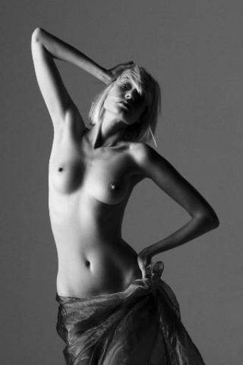 Really nice composition and pose. The diagonal frame created by the elbows is terrific, keeps the eye contained within the image. Nice tonality across the image too. Would like to see the very bright hair on the right hand side zapped though - its very distracting.
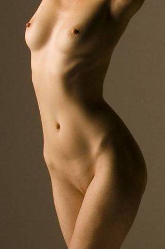 This is a lovely, gentle art-nude image. Very nice. You could maybe a get a slight improvement by cropping slightly higher on the thigh. For posing this dropping the arms a little would probably have given a better bust shape.
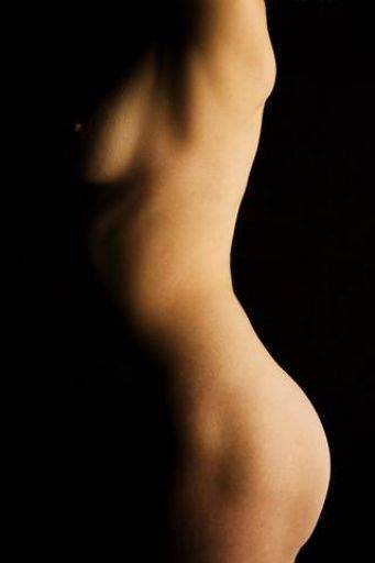 Ooh, like this, very different unconventional, love the way there is just that hint of nipple. Lovely image.
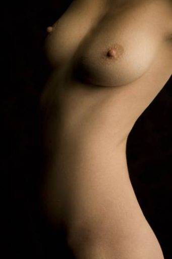 Not so keen on this one. Firstly we've got a kink on the waist, secondly the bust shape is not so good, a raised arm would have helped. In fact it looks like her right arm is raised and the left arm less so - so her boobs are different shapes. This also reveals too much skin patterning on the hips for me.
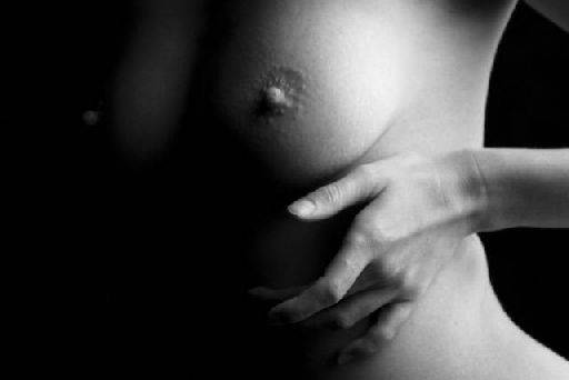 I really like the crop on this, and the juxtaposition on the soft curves and the hard fingers - my only objection is the the index finger is out of pattern with the other fingers - I know very picky! :) The way crop cuts to just the crux of the armpit and to the edge of the hip is cool.
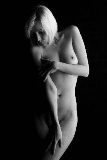 Again a lovely image, perfectly gentle. It really shows that big softbox working doesn't it? That very broad and gentle light works perfectly here. Nice crop position, nice framing, nice contrast and tonality in the image.
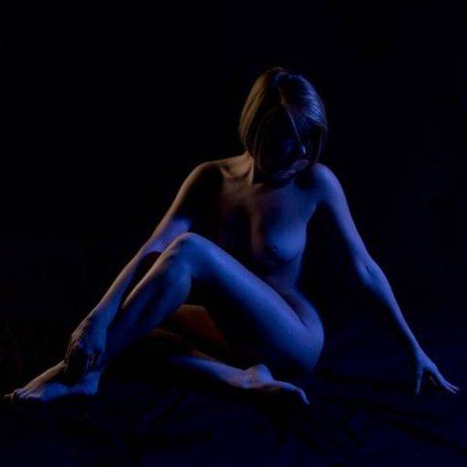 The two bad points on this image are that the crop is just too tight on her toes on the left and that her nose has a bad highlight. Both of which are fixable. The colour schemes works well here, very eye-catching and a nice level of saturation (I would go for deeper colours - 'cos that's what I like). The post is terrific - perfect triangular shape - absolutely classic. You've also managed to capture the toes and fingers correctly too - its very easy for either of those to go ugly.
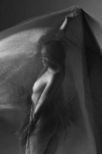 This must be from the motion sequence!!! The amount of movement in this image is pretty much spot on - its enough to give that wonderful "ghosting" softness and create the sense of motion perfectly, but not so much that's its gone too blurred. Definitely has the most "creative" feel to it. The other images are good art nude, but this one is out of the tradition - well done.
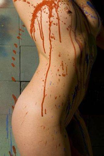 The echo of the splashes on the wall and the curve of the spine - terrific. You could almost create a very narrow crop of just the left hand third of the image. That would be quite abstract and very interesting. There's also possibly another image in the top quarter of the image too.
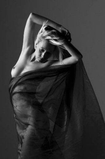 Well caught image, the trick with someone like Iveta who is giving you lots of poses is capturing the right ones and adding your own direction in too. When you're faced with the wind machine as well adding its own random factor it can sometimes be hard to say you've "made" the picture. I especially like the way one half of the bust is covered and the flow of the material down the right hand edge. Again I think there might be another picture just using the bottom third.
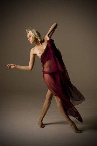 Less convinced by this one, I think you're angle is too high and maybe lens too wide and it gives an awkward angle and distortion to me. Then the hair on the fringe is too "sprouty", the hand on the right awkwardly angled and bunched in the cloth, the feet are poorly angled. I may be getting the wrong vide, and maybe you liked the whole awkwardness of the image, for me it doesn't work.
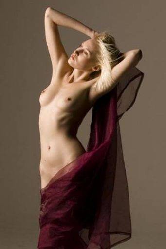 Whereas here the hair is perfect from the wind machine, gives it life and dynamic. Also the way the wind holds the cloth to the body is good. I'm not so sure about the colour combination and this maybe better in monochrome. The mole and line on the tummy are distracting, they could be cloned out. OVERALL: This is a good set, its interesting how women approach these sessions compared to men, your collection is much softer in tone throughout. Those images which approach the more traditional view are very good, and your sense of framing and composition is very strong. Good set.
share:
I run regular workshops for beginners and experts alike. I like to run a mix of styles and types. Masterclasses, portfolio builds, technical and artistic sessions available.
Current courses available.