Critique for Kathleen-Pinup Workshop
Kathleen was one of the attendees at our recent Pinup Shoot Workshop in conjunction with the Royal Photographic Society (RPS). These are the images Kathleen has selected for critique.
Kathleen - have a chat to Mike or Dave about their post processing techniques, I like the styles here, and they've got some good systems for making them look more painted.
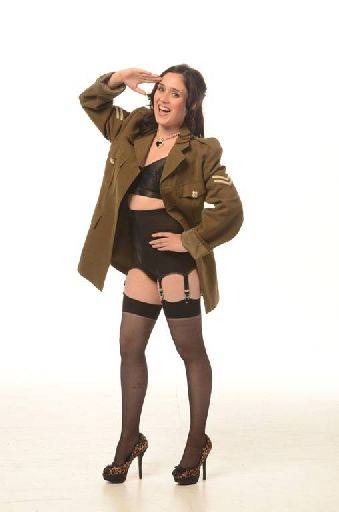
Great pose and expression, but let down by the camera position and wide angle. You need to keep the lens zoomed out as far as you can - 100mm is about right (adjust if your camera has a crop sensor). The combination of being too high and too wide has badly distorted the image. Your camera height should be somewhere between bust and hips for a long shot like this.
Shame, because the pose is great.
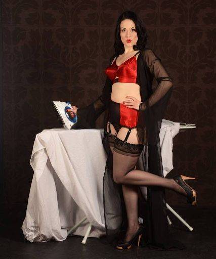
Capture is perfect, lighting could have done with a bit of extra around Tefnut's hair and shoulders to separate her from the background. I know that wasn't your department. I'm not sure about the big sheet, something more alluring for her to be ironing would have been better. Also looks a little wide angle.
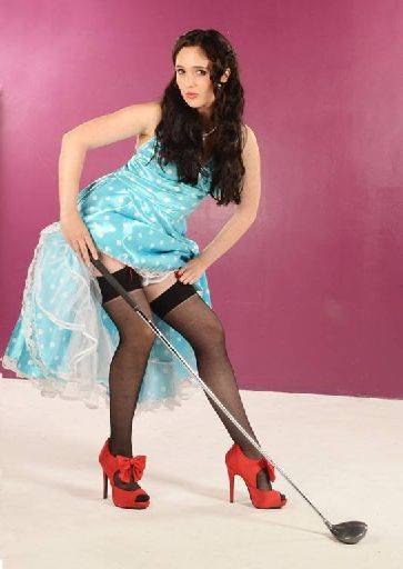
The face doesn't match the rest of the picture sadly, Leah needed a more happy, smiley face. The shape of the pose is good, love the angles - created a nice triangular format here.
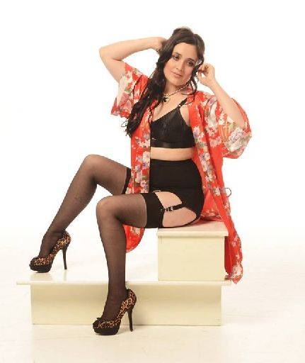
Lovely and gentle, nice work on the legs, the pose is lovely, open, inviting and no eye contact. Could just do to be a little lighter. Try a duplicate layer with blend mode set to screen - adjust opacity to taste. The belt loop on the right should be cleaned up,
A little tip when shooting across surfaces like the boxes, try to get the camera height to the same position as the top of the surface, this cuts down the amount of actual box that is show and looks better for it.
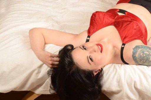
Smashing. The crop is slightly too far left (you could still lose a lot of the left, but it could with a hint more on the right). Clean up the darkness at the bottom of the image. Terrific.
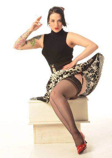
Best of the lost, really love this, the whole pose, look, facial expression, cigarette and post processing. Terrific shot.
Clean up the boxes and straighten them up, they are wonky. If you are up to it, see if you can replace them with just a plain single white box. The lines and shape are a bit distracting.
See if you can slightly reshape the lifted skirt so it doesn't quite look so "fishing line". There are some wrinkles on the torso on the right that could do with straightening out.
But love this image = cracking.
If you are the lady with the broken leg, then you have an excuse for the camera position stuff. Either way, get a willing volunteer for 10 minutes and just take a bunch of reference shots at difference camera heights and different distances/zoom length from the subject so you can get a good sense of how lens length and camera height affect the image.
share:
I run regular workshops for beginners and experts alike. I like to run a mix of styles and types. Masterclasses, portfolio builds, technical and artistic sessions available.
Current courses available.