Critique for Ken
Before I start, it's nice to see a completely black and white set. It's strange how few black and white's we see from these workshops these days, I think because it comes out of the camera in colour people tend to get stuck there. Whereas to my mind this kind of work is much stronger in mono.
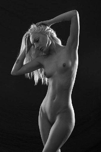
This image is very close, but the details in the lighting haven't taken it the top level.
The lighting is not working here to bring out the form of Pixie's body (just look at the next image to see it working well).
The bright lights on the face, the loose streak of hair and jaw line are all a bit at odds with each other. Pixie is just a little too square on to the camera. When I say close, probably a turn of 3 or 4 degrees would have changed all that.
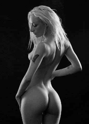
Whereas with this shot everything has come together right with the lighting, every bend, flex, muscle and bone is really nicely revealed by the lighting here.
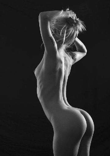
I love this image all the way up to the hair. Crop it tighter in to remove the hair and little of the legs and make it more abstract for a much stronger picture. (Look out for the little spot on her back as well).
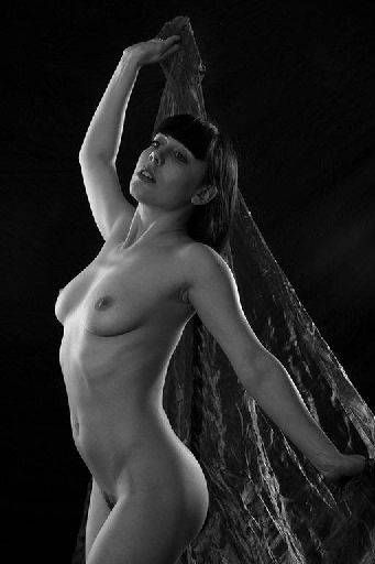
It's a shame there is that little hot-spot right on the end of her nose. Compositionally the diagonal sweep through the frame works very well.
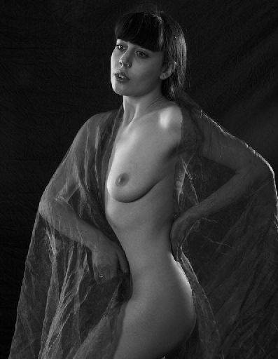
Nice gentle shot. Just zap the ring on her finger, it is distracting. Nice gentle tones through the image.
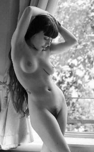
Smashing natural light shot. Crop is spot on, she's got long legs but no knees, exactly how it should be :)
A slight tweak to the pose would have helped the bust shape a little, balancing them both up.
For me I would want to remove the two lines from the balcony outside, just blob them out with out of focus tree,
Good set. Nice to see them all monochrome.
share:
I run regular workshops for beginners and experts alike. I like to run a mix of styles and types. Masterclasses, portfolio builds, technical and artistic sessions available.
Current courses available.