Post workshop image critique for Louise
Louise attended one of our RPS workshops, she has submitted some final images for critique and review like all our attendees are encouraged to do.
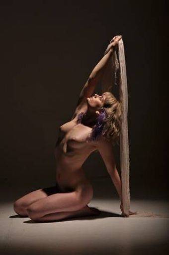
Love the shape and composition in this, nice use of negative space. I think this would be better in mono.
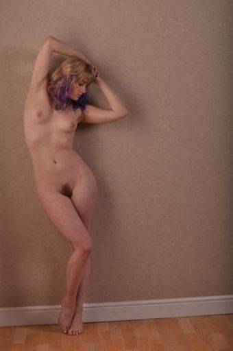
Aaargghhh! It's all wonky. Love the pose, the gentle light, lovely shot
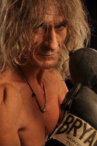
Should be mono, good shot, though maybe over lit to the front. Convert to mono and bump up the contrast.
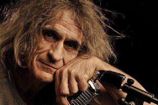
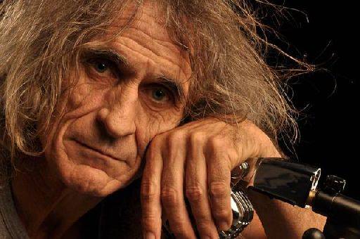
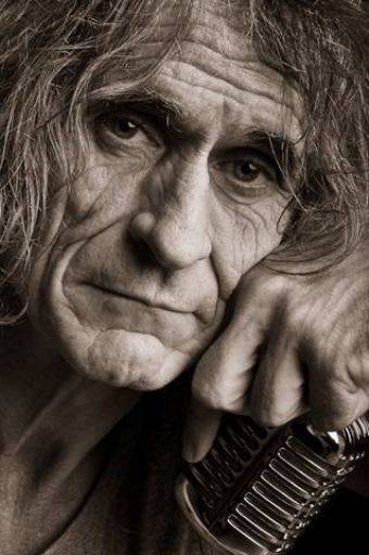
Essentially three identical shots, obviously taken in very quick succession. Everyone will have their favourite, and in any kind of panel submission you must choose the one you like the most. For me it is the first because I love the gentle smile on Jon's face.
The lighting is perfect, enough to show all the wonderful character in Jon's face, without going for the stereotypical side light.
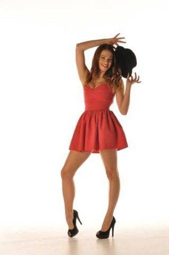
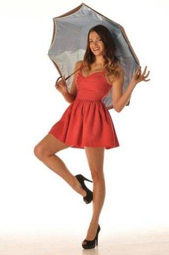
What bugs me about both these images is the lighting is too low, it shines up into the face, rather than down. Which is shame because they are both fun shots and I like the way the umbrella frames the head.
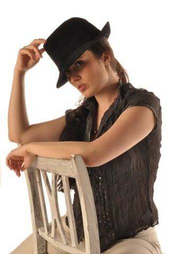
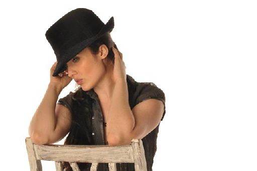
Again two shots very close in sequence, but the first works better, the way the hand and arm create this inner frame around the face work very well. The light reflecting off the floor has lit the face well despite the shadowing hat.
In the second shot, the turn of the head has meant the eye left in picture is awkward.
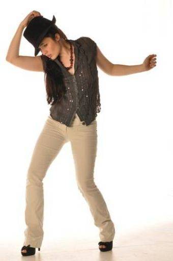
Bit more breathing space to the left of the crop would help. Sadly the face has the same problem as the previous image.
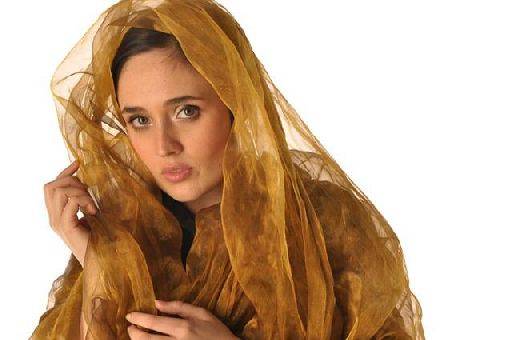
Love this, the gaze, the colours the hand. I think this needs a tighter crop to lose the space on the right and the fingers at the bottom - this would make a much stronger image.
This is a strong set overall - you have a good eye and capture of the expressions is very good.
share:
I run regular workshops for beginners and experts alike. I like to run a mix of styles and types. Masterclasses, portfolio builds, technical and artistic sessions available.
Current courses available.