Critique for Martin
After every workshop, whether through the Royal Photographic Society (RPS) or privately, attendees are invited to submit images based on the workshop for further comment. I always hope to provide information suitable for the individual and for others readers. If you are interested in attending any future workshops, please contact me sqw @ FilmPhotoAcademy.com
Martin was one of the attendees at the recent RPS Creative Nudes workshop. Here are some images he has sent for review and my comments.
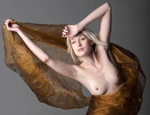 First up a general comment, I would be much happier if the tiny blemishes were removed, they can be very distracting in a still image. In particular I'm looking at the two moles on Iveta's torso. On a similar note, for my personal preference I would smooth the skin a little as well. Particularly since the poor girl is standing in front of the wind machine you can see her poor goose bumps! However, that might be something you like. I love the top half of the pose, very dramatic and the pale tone is terrific. The crop is spot on. I wonder if you could boost the saturation in the cloth just a little to bring out the colour and highlights.
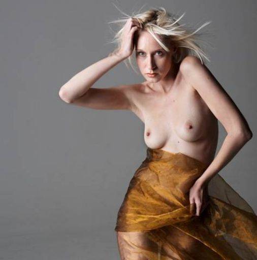 Same comments as above about skin and moles, but this is terrific - the pose is so strong and really reveals Iveta's bone structure perfectly around her collar bone. The light and shadow are terrific and the hair is great.
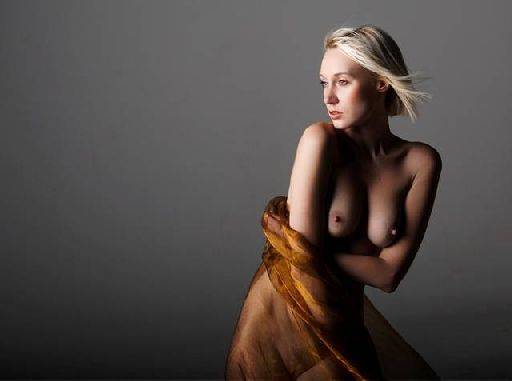 Much softer image also works well. I really liked this image until I spotted the truncated arm! Iveta's right arm just disappears - she could either be playing with herself or its just lost and sadly that ruins the shot. The highlights are a bit cooked, but the shadows are lovely. For this more gentle image I would be tempted to clean the stray hairs above her head (the ones at the back of her head are fine). This may be a function of reducing the size of the image, but there seems to be a lot of banding in the background. Try heavy duty softening of the background with some noise added to see if that helps - a larger version may not have this problem though.
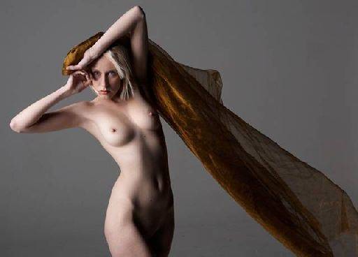 Terrific shot again, love the way the two hands are opposing each other - almost like an inverted yin-yan symbol. The tonality is really nice, the gentle shift from light to dark. The drape does lose it's impact a little as we get to the right hand edge of the image. You could either crop it harder on the right or see if you could get some more brilliance into the cloth - both in light and colour.
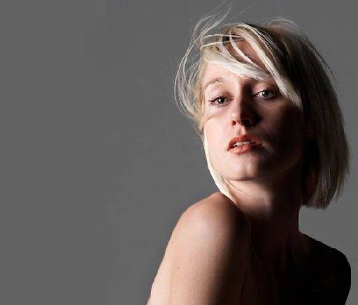 do like the overall pose shape, with hand back into frame by the face keeps a good circular eye track to keep within the frame. In the closer crop that lost of course, but on the other hand I like the off centre position in the closer crop. As a set overall, despite my somewhat picky criticisms these are very good. I'd be tempted to try some variations on these images. Firstly, how do the look as black and whites, they may actually be much stronger monochrome than colour. Secondly, keep them as colour, but warm them up, put some warm tones, boost the colour and see where that leads. It is a personal choice, but personally I think they would be better with a smoothed out skin tone. In any event, moles and other little blemishes need to be taken out as spots are always distracting to the eye. Look forward to seeing some more from the other sets.
share:
I run regular workshops for beginners and experts alike. I like to run a mix of styles and types. Masterclasses, portfolio builds, technical and artistic sessions available.
Current courses available.