Critique for Michael S
After every workshop attendees can submit images for a final critique - this is a valueable part of the learning process.
These images were taken at our recent workshop with Ivory Flame at Image Red studios by Michael S.
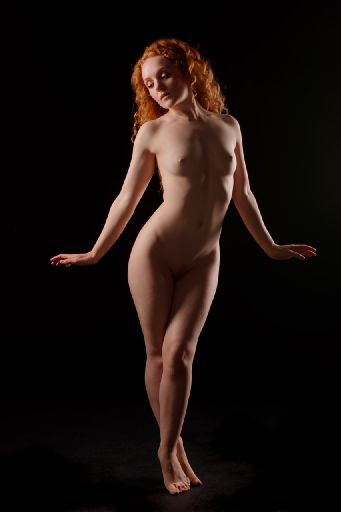
The immediate thing that springs out to me is the floor. Because the greys and blacks are banding on my screen. This may be due to your final processing when reducing size to send to me, or it me be present in the original.
Very dark areas like this can be a real pain in images. So much so that I try and not shoot feet at in this kind of set up. The trouble is if you make the floor black to match the background the figure looks like it is floating in mid-air.
You can try adding in some noise and some blur, see if that breaks the banding up. You could try just bringing all the shadows up in brightness see if that creates a better structure.
As for the overall shot, I like the pose, the lighting is right. It is a good example, though lacking a bit in drama and interest.
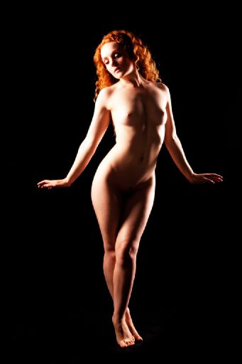
So boosting the contrast has sort of helped, though it is still slightly broken around the feet. But, more worringly the highlights are over bright now.
To me this looks like it was shot a little too wide - pulling back a little bit and going for a longer focal length would improve the overall shaping.
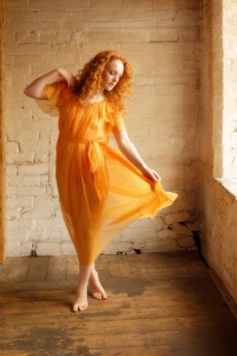
Smashing shot with lovely tones.
The edge of the pillar on the left needs to be cropped out. Normally a bright edge on the window side would be distracting but in this case it adds a valueable part of the story, the whites are nicely held on the window edges.
This suffers again from being shot too close. This means that the floor is too dominant in the image. This is in turn exarcebated by the camera height - which is a little too high. For this kind of shot you want the camera to be down at the subjects chest or even stomach height. Bit like the previous shot though - you could crop just above the knee and do nothing but make the image stronger.
The colour tones are really good, that lovely softness (in post?) works really well. Notice how the light has brought out every fold and pleat in the material.

Good "see through" shot. Your camera position is interesting here - see how you get the leading lines from the floor and it exaggerates Holly's height.
You need to be careful with "frame within a frame" - Holly is very close to the edge of the window - which is acting as an internal frame. Her front is falling right on the line of the window edge causing some confusion.
Again I really like the tones, I like the way the colours are reflected back into the wall as well.
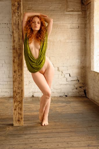
I think this is the best image of the set. In this image everything looks deliberate. You have the two strong verticals of the pillar and the window frame. Holly then sits in juxtaposition to these - with a very upright torso but a perfect kick in the hip and legs.
The hair tones work well with the pillar and against the green scarf.
I like the way the green scarf provides an inner compositional circle, it keeps the eyes returning to Holly's expression.
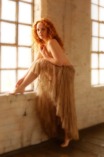
Nice soft and hazy image.
Firstly the background is right, enough large areas of white to be deliberate, with nothing visible through the windows.
Then we have Holly placed so the darker wall is behind her, this allows the rim lighting of the rear window to separate her back and the main light from the left window to give all all the structure to the image.
This is a very good example of an image being soft, yet still revealing all the detail where it counts - for example in the hair and in the skirt.
Overall I would like to see you shooting with a longer focal length. All of these feel too close to me. Apart from giving some perspective distortion on Holly's figure, this is also bringing in too much of the surrounds in an uncontrolled way.
I would also like to see you shooting closer in. The closer you are, the stronger the picture - in general you can lose the feet in every picture - cropping above the knee stills feels like a full length image but cuts out so much wasted space.
I really like the way you have managed the colour tones in these images.
share:
I run regular workshops for beginners and experts alike. I like to run a mix of styles and types. Masterclasses, portfolio builds, technical and artistic sessions available.
Current courses available.