Critique for Nick S
Nick came on our recent workshop Location Nudes with model Maggie Lou. We were shooting in and around Maggie's barn on a very sunny day.
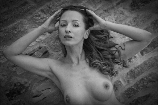
A bit of clean up on Maggie's freckles and moles will help here. The trouble with moles is though they are not noticeable in the flesh, when you get them on a print they look like dust marks and are very distracting.
The big issue with this image is the eyes, they are slightly too closed and don't look decisive enough. They could have done with being a little wider open or completely closed.
The palms of the hands are a little bit facing camera. The crop is a little tight on the bust.
I like the treatment and vignette, but it has meant that Maggie's elbows look much darker and almost dirty.

This is lovely and captures that Mediterranean feel we were going for. Full marks for going for the letterbox crop, though it is a little tight on the top, you could leave a little more room above the knee.
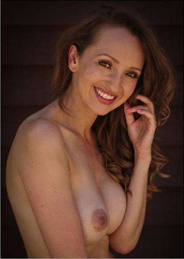
The upper half of this image is slightly darker than the lower half and could do with balancing out. Use the gradient adjust tool to sort this out.
The reflected light looks lovely and the expression is really nice. A very happy sunshine girl.
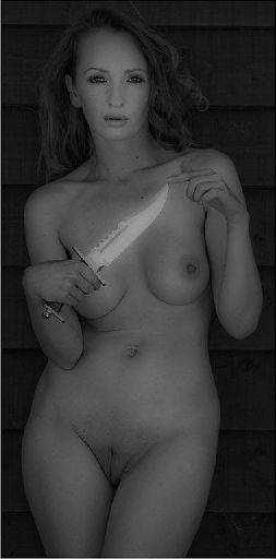
The treatment on the body has worked OK, but looks overdone on the face. See if you can pull back some of the effect on the face. The hair is a little lost against the background, just slightly lightening the hair will bring out a little extra definition.
The pose and expression have worked well and the tight crop adds to the image.
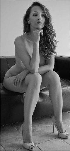
As in the earlier picture we've got a slight problem with the eyes. But the rest looks great. Nice range of tones, powerful and positive pose, clean simple lines - a good location shot.
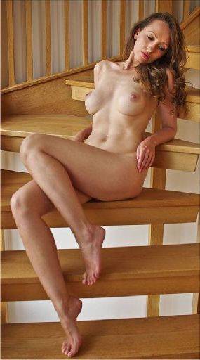
This looks lovely and warm, nice rich tones throughout. You've caught the stairs well, despite them being "busy" they work well in this setting. The pose is good with the feet and legs well placed to give a nice shape through the image.
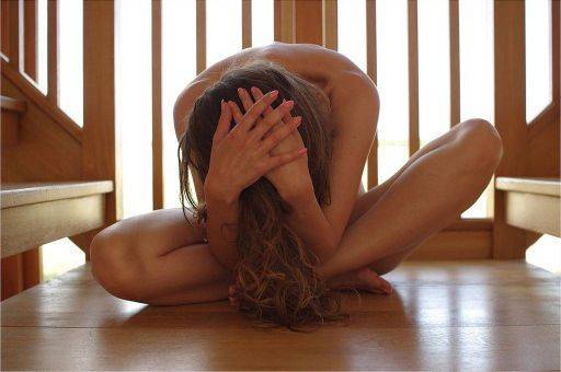
You tagged this as one the "didn't work", and it is close, but not quite there. The first problem is that the leg positions would be better either perfectly symmetrical or more deliberate asymmetric.
The second problem is the hands, which are very flat to camera and would have been better on the top/back of the head.
The lighting is lovely, the backlight on the body is really nice and a good control of exposure throughout.
share:
I run regular workshops for beginners and experts alike. I like to run a mix of styles and types. Masterclasses, portfolio builds, technical and artistic sessions available.
Current courses available.