Critique for Robert M
From our workshop at the weekend with the stunning Maja Stina workshop: "Urban Decay"
Shooting entirely with natural light in a disused workshop in Birmingham.
After every workshop attendees can submit images for review afterwards, these are Roberts.
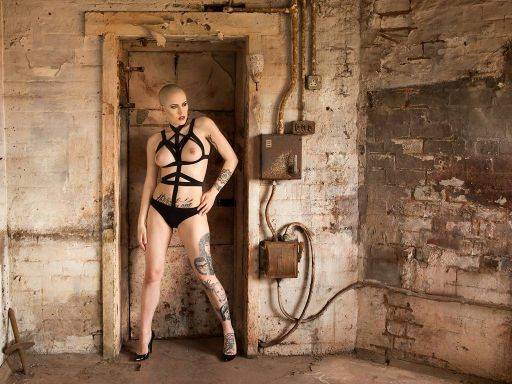
Could do with a little more contrast or clarity I think - it's just lacking a little punch. A slightly lower camera angle would have given a better shape to Maja.
I like the composition, nice division of the frame into five panels, with Maja offset into the second and framed by the door. That works really well. I hope that was intended and not accidental :)
I think a cool tone would work well on this image.
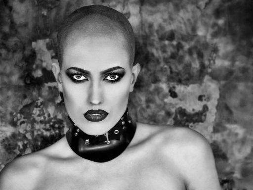
The whites of the eyes look a fraction overdone for me, just tone them down to slightly off-white. They might be real as they are but they look over processed.
Very nice use of contrast and monochrome conversion on this image. The catchlights in Maja's eyes are amazing. I like this off-centre composition - does it look better or worse if you crop to put Maja dead centre?
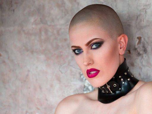
Very strong red tones here, it's caused by sunlight reflecting off the building opposite, the image could do to be a little cooler, also watch out for ears, which always have more red than the face.
The separation foreground to background is spot on - enough texture, no distraction.

Whereas here we've got a little yellow cast from the colour of the walls. I like the overall pose - very simple but defined, though I think Maja needs to be more off-centre or bang on centre, this does not look "deliberate" enough.
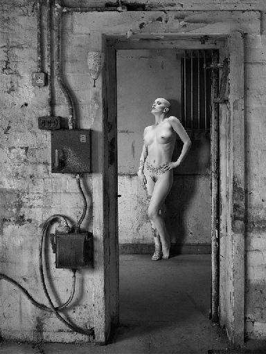
Interesting that you've flipped this - I think that's the correct thing to do. Something that now we work digitally we don't do enough is check the flipped version - often it can be better.
The light falling across Maja is pretty near perfect, there's a good sense of top lighting as well as the the side. Lovely detail revealed in the anatomy.
The frame within a frame is great.
I thought this would be a colour image when you were shooting it - interesting that you've gone monochrome.
A great set of images, well seen, well edited. Well done.
share:
I run regular workshops for beginners and experts alike. I like to run a mix of styles and types. Masterclasses, portfolio builds, technical and artistic sessions available.
Current courses available.