Critique for Terry
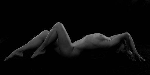
Interesting image and pose - I like the way the face is completely hidden.
Tonally it's not got great definition, for me I would want to play around with curves and levels so there was a greater dynamic range across the image. Currently it is all a little on the dark side.
I would also add just a little more room left and right in the frame, it is just over tightly cropped at the moment,
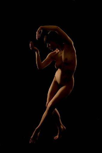
Very interesting pose and shape again - lovely lighting across the face and torso
As with the first image I think there ought to be a little more dynamic range in the image, a little more light in the shadows and the main figure.
It looks very warm - this might have been added afterwards in which case OK, but it could do with a little cooling blue tones for me.
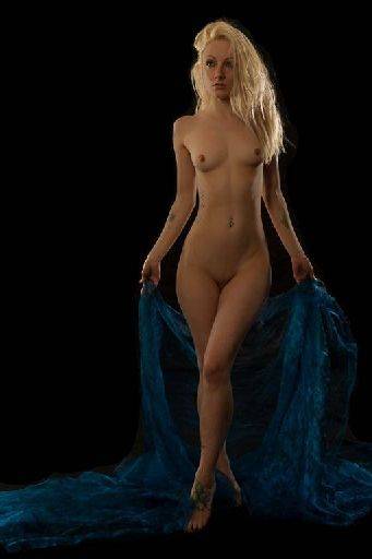
I like the pose and I like the hair, but the expression looks more distracted than interesting.
Top half of the lighting is good, but the bottom half definitely needs an exposure lift. This is a common problem with studio lights because you get a fall off towards the ground.
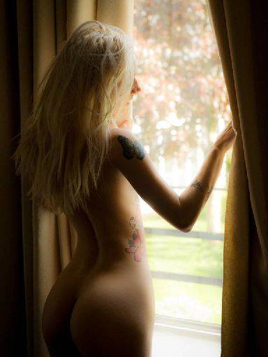
Smashing. Well controlled light - I like the lighting in the shadow areas too - I hope that was added with reflector rather than being accidental :)
I could be picky about the nose line, but that's being very picky.
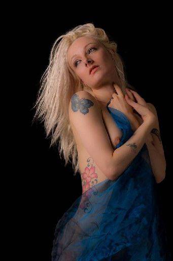
Trouble is here between camera angle and pose we've got a strong shot up Pixie's nose and it leaves the eyes looking half closed.
I like the way you've worked towards a dynamic shot and for almost any other shot the camera position would have worked absolutely fine. Like the colour contrasts blue and skin.
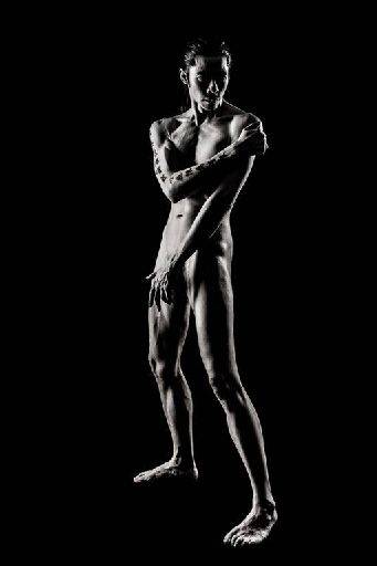
Cracking high contrast shot and cracking pose. Very strong image. The hatchet lighting on the face is great and the way the light really outlines the legs is perfect. The high contrast finish works well on this image,
Best of the set this one.
share:
I run regular workshops for beginners and experts alike. I like to run a mix of styles and types. Masterclasses, portfolio builds, technical and artistic sessions available.
Current courses available.