Critique for Dorothy
These images were taken by Dorothy at our RPS Weekend Extravaganza in October 2010.
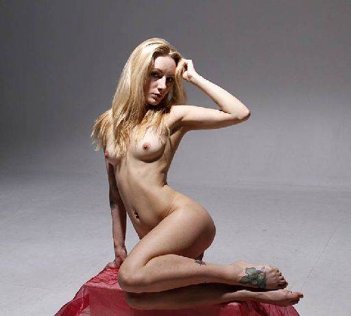
Nice graphic nude study, the hard contrast works well here. the angled pose is good and the lighting on the face is caught at the right moment.
When creating images like these with a mid-tone grey background it does need to be cleaned up. Try and select the whole background and gently blur it to just clean it up.
Like the way the tattoo on the foot is angled to the camera.
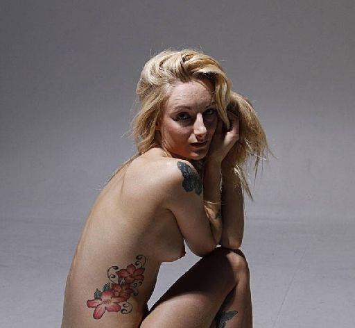
I'm not quite sure if there is an image compression problem when you were preparing these for email, or whether this is camera settings or post-processing settings. All of these images look very noisy - to me they look over-sharpened.
Generally for the female form you want to keep the sharpening as low as possible, you're looking for smooth skin tones rather than hard ones. So on Nikki's face here the wrinkles are very exaggerated. The rest of the pose is lovely - there may be a really nice image just cropping around the torso focussing on the negative space caught in he middle.
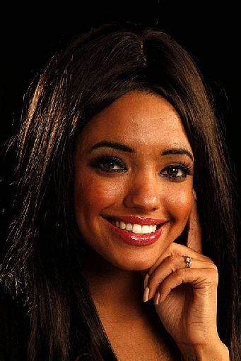
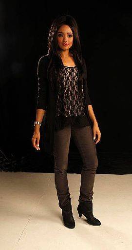
The portrait is spot on, shot narrow side, lovely expression, twinkle in the eye, delicate hand smashing. The full length is well caught, but (a) has been shot to wide-angle and (b) too high, this has distorted the image and included too much distracting floor.
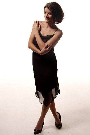
Like the cheeky look here, but the better picture is the one cropped just below the hands. See how the hands are shaped to give you a continuous circle, as a tighter crop the eye will really enjoy just circling round in the frame.
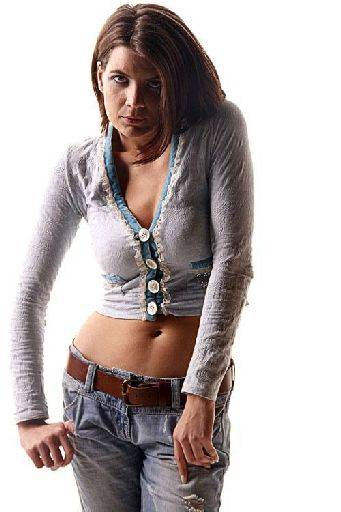
Well caught expression to go with the lighting and pose. A whole sense of awkward teenager caught between the light and dark.
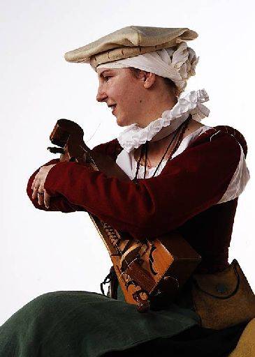
Nice portrait, with the gaze away from camera, the pose shows how the instrument is valued. It's a little dark in the materials, a little post processing could bring some lightness and colour in to the cloth.
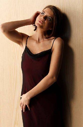
Spot on fashion pose, light and position. The crop of the elbow is a shame, because apart from the that you will have seen this picture in many fashion magazines.
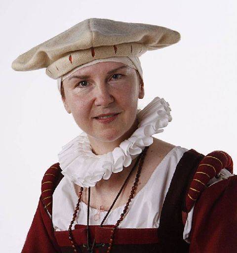
Well shot, head and shoulders, catches all the interesting things about the costume and the face.
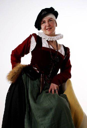
Whereas I'm afraid this looks awkward, I think the wide angle is giving a very difficult "lean back" to the whole image and of course makes the head look small in comparison.
I'm worried about the image quality, but if it is only the emailed images then you're fine. If it's some artefact of the camera then you may need to review the camera settings. Look for neutral camera settings.
Your head and shoulder shots are spot on.
share:
I run regular workshops for beginners and experts alike. I like to run a mix of styles and types. Masterclasses, portfolio builds, technical and artistic sessions available.
Current courses available.