Floor

THINKING:
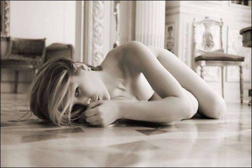
I love the 1960's retro feel to this image. The original colour image has too much information in it - as you can see the background is very busy.
By pulling it down to monochrome - with a slight warm tone - and using a wide aperture to soften background lessens the effect of the busy location.
SEEING:
Raphaella's eyes, just peaking out behind the hair and hand, are the first draw in this image.
However, it is actually the matched shapes of the arms and legs that really do all the work here. Notice how the angles created by the shoulder and arm; and the hip and leg are exactly repeated.
This type of echo within an image although subtle, and indeed often not recognised consciously by the viewer, is what makes this image.
When you are looking at your 'nails or contact sheet it is often these small details that make the picture stand out from others in a series.
DOING:
The camera has to be right down on the floor for this type of image. You have to shoot across the floor rather than down onto it. Even slight shifts in camera angle down to the floor (or slight increases in height) will make the floor much more dominant in the picture.
Also, it is natural to shoot with camera, model and background all in-line. But here I am shuffling around the floor to get different viewpoints. So now I am looking down the body rather than across it. In addition, the background is no longer square to the model and camera. This new angle is interesting.
share:
This is an excerpt from "Art Nude Photography Explained" which shows you how to create nude images and how to read and evaluate art nude photographs
It is available on Amazon
or on
the store