Pinup Shoot Critique for Ed
Ed came in for a one-on-one mentoring session shooting pinups with Nikkia Sabblier - who runs her own fifties / retro clothing shop as well as modelling.
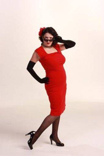
What I say about this image applies to a most of the images here, which is it could do with a bit more "pop".
There are a number of things you can do:
1) Look up Edge Contrast Enhancement on google - this is a technique for abusing the unsharp mask filter for giving extra "crispness" to an image
2) Look at boosting the contrast
3) Look at boosting the saturation - either globally or locally
4) Look at increasing the brightness a little - any female portrait can handle being a little over exposed and it helps with skin tone etc, but also adds punch.
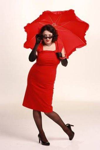
Both of these images are lovely poses, Nikkia has the kind of figure that shows this off well, I love the way the umbrella halo's her face and head.
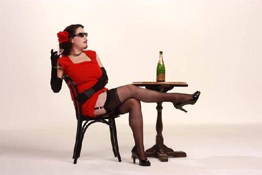
Ha, great fun, it could do with just a little extra separation of the glass from the face, it sort of merges a bit
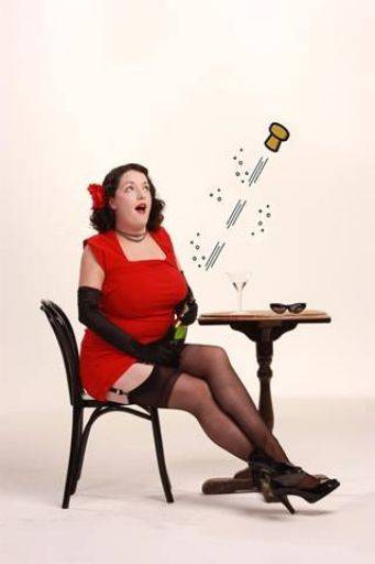
And this is even more fun - not the sort of graphical manipulation I'd normally recommend but this is so perfectly suited to the style of the shoot, Much better than a photo-realistic cork. Well done.
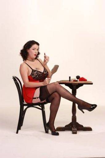
This ones a bit windy - it would present better as a 10 x 8 crop.
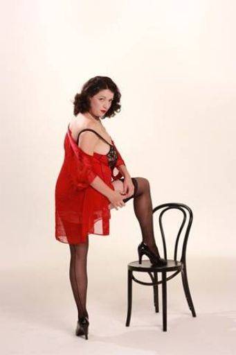
I'm not sure whether this is the pose or the focal length you were shooting at, but this looks a little dumpy. I think the shoulder to camera coupled with a lot of bare skin pushes things out of proportion a bit. Which is a shame because it's a lovely shot. Maybe a little messing with the liquefy tool and or warping could fix this.
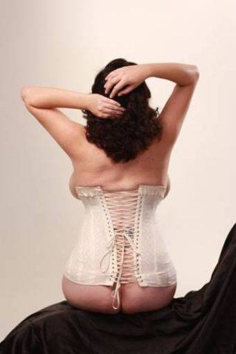
I like this - would love to see a really contrasty black and white version.
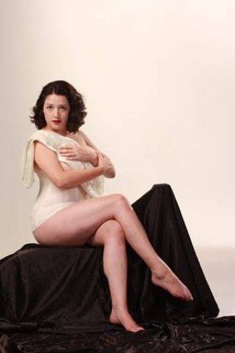
Terrific gentle, elegant and timely pose. The chaise hasn't helped here, it's an awkward shape, maybe some cloning to remove the lump and fill the right hand side.
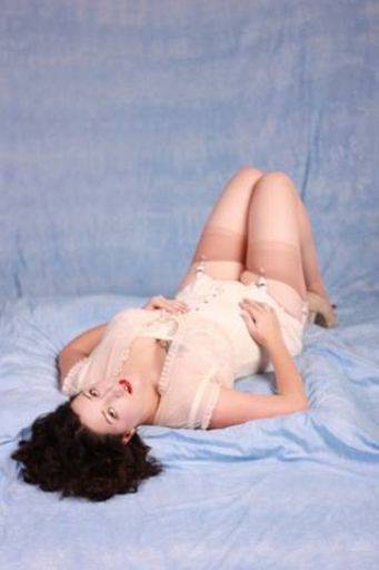
Smashing. You could probably add a little more artificial softness to the cloth
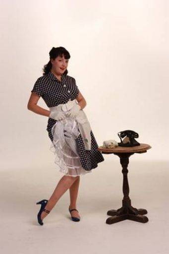
Under-exposed but I like this.

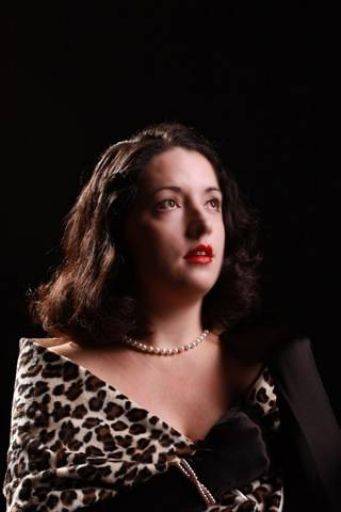
Skin smoothing on the face has help a lot here, could do with some on the neck as well. This kind of side lighting which is a hard can be tough on the female skin, since it reveals the littlest of defects, so definitely some skin toning required.
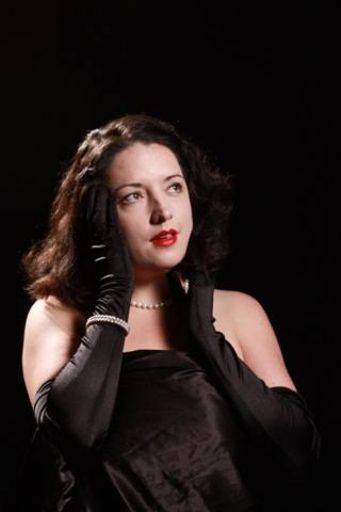
The blacks are all a little blocked up on this image. Use curves to lighten the dark areas just to bring a little life and light into them. The top could with cropping off.
All in all though a good set of images - you're work in the studio was very strong and positive, good control and understanding of light and lighting mechanics. Just a little brush-up on the photoshop side and you'll have this cracked.
share:
I run regular workshops for beginners and experts alike. I like to run a mix of styles and types. Masterclasses, portfolio builds, technical and artistic sessions available.
Current courses available.
