Post workshop critique for Colin
Every workshop attendee can send in images for critique, this is a valuable part of the whole workshop process as the author has a chance to work on the images, do any post processing that is appropriate and look at the images in the context of the whole shoot.
The images selected do not need to be the "best" from the shoot, they may include failed images where the attendee wants to know why and how to improve.
That said, here's the critique for Colin.
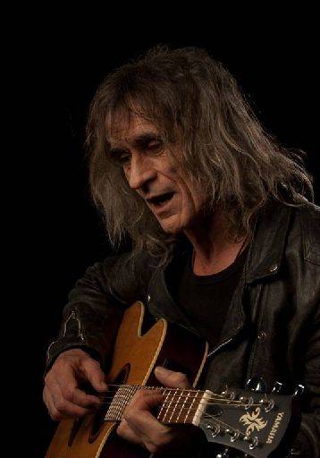
The first problem is that ALL the images are very dark, this looks to me like your monitor for editing is seriously out of whack in terms of brightness. I've increased the exposure on all the images below, this may not have been what you intended but I'm guessing here.
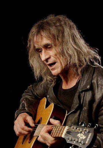
Nice action shot, good use of lead-in with the guitar.
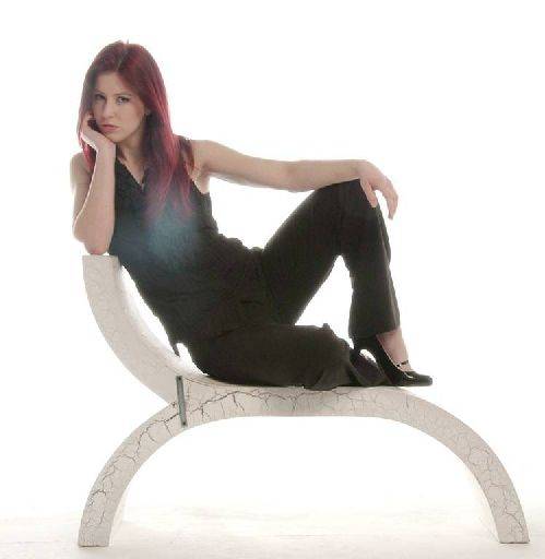
There is some technical problem going on here. The white patch on Harriett's chest looks to me like lens flare or diffusion. You can get this shooting high key images with older or poorer quality lenses. They may appear to work fine in most circumstances but when faced with that big splash of white flashing back into the camera you get this washed out look.
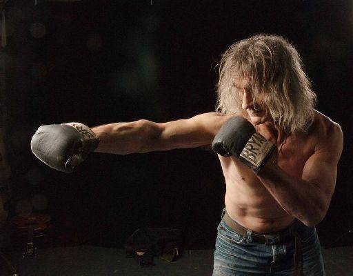
This image is close, but I feel it's been statically posed, rather than caught in action. With any shot like this it is almost impossible to set the same energy and motion in a posed version - get the model to act it out, shadow boxing in this case.
The problem with photos of this kind is actually the space used in the frame is quite small, leaving a lot of negative space around the subject. Which might be fine for a flower study say, but it means that an image like this does not have impact.
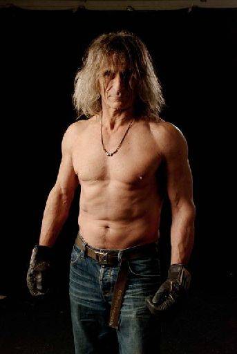
Here you already get more impact, just because the subject fills the frame.
The lighting across the torso and face is superb.
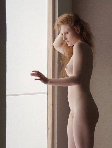
Lovely shot, nice and delicate. I would want to clone out the line in the window frame and probably crop to remove the whole left edge,.
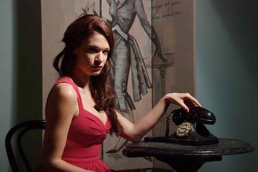
There's some good stuff going on here, but the lighting on the face just misses. The overall feel of a "noir" style shot looks good, but just having the eyes in complete darkness sadly lets the shot down. This really ought to be a contrasty black and white in my opinion.
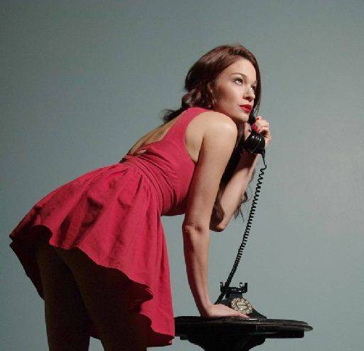
Cheeky is the word I'm looking for, Though actually its the face that lets the image down, the head is turned to far from camera, leaving an odd eye and rather awkward nose across the cheek.
I'm not sure whether the legs should have been lit or not, clearly in shadow is a different story to if they were lit.
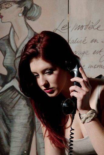
Whereas this phone shot works much better because the lighting on the face is fine. Again I feel it really needs to be black and white.
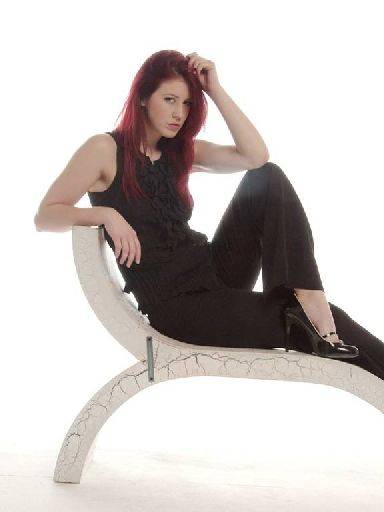
OK, but the crop is awkward across her leg and to be honest all the interesting stuff is in a much tighter crop around her face and hands
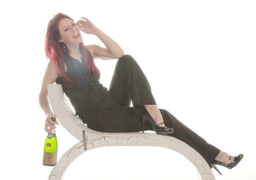
This crop makes more sense with laughter etc, but the long shot tends to lose on impact of course.
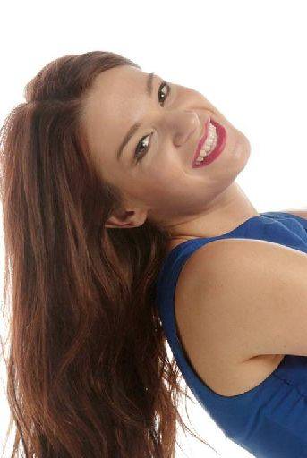
Where as coming in tighter has given you a more impactful image. I really like your thinking about the way this was posed and cropped. Sadly it's left the arms with a really odd placement in the frame.
The other issue is that as the head has moved relative to the light source you are now getting a light that is coming in from the lower side of the face, so the lighting is not as nice as it could be.
The main thing though is sort out your editing setup. Your monitor needs calibrating for brightness at a minimum.
share:
I run regular workshops for beginners and experts alike. I like to run a mix of styles and types. Masterclasses, portfolio builds, technical and artistic sessions available.
Current courses available.