Post Workshop Critique for Richard
These are images from my recent Fine Art Nude Workshop, taken by Richard. After every workshop attendees can submit images for critique and follow-up.
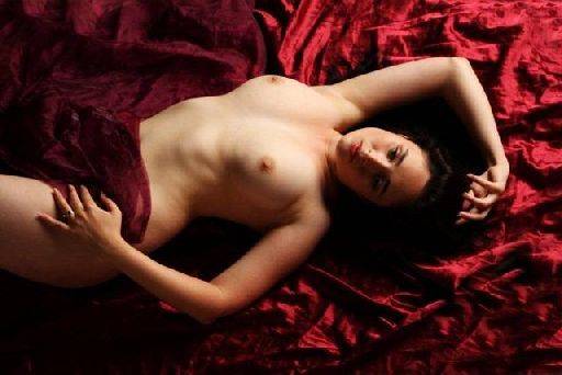
Lovely. Only comment is that I would bring up the light levels in the left corners just to balance the overall light tones of the image.
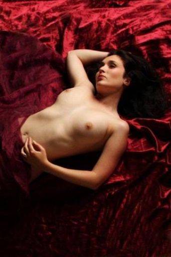
Equally lovely, the drape looks great, the pose is lovely, Leah looks lovely.
In this case the dark base works because it provides a base for the image.
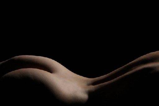
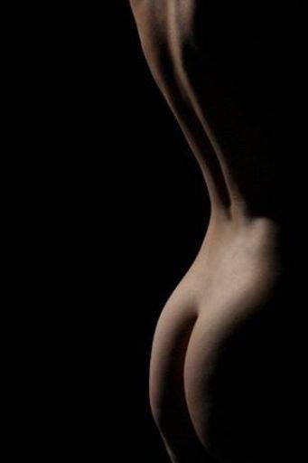
These two images are of course the same just rotated, I understand the thinking about this and to be honest both work equally well. The top image gives you that sense of landscape while the bottom image is as shot.
Of the two, I think I prefer the landscape format. The lighting is perfect on these, just skimming across the figure. Crop is absolutely spot on as well. Love the fine edge separation of the back against the black.
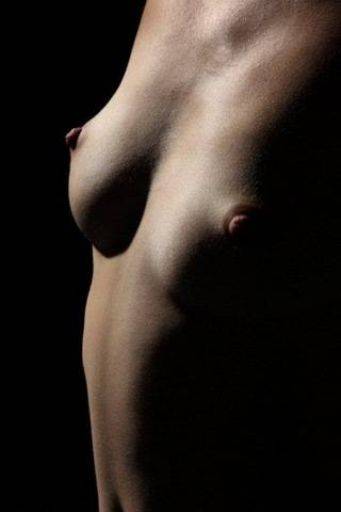
Not so happy about this one, to me its like two eyes looking wall-eyed :-)
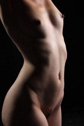
Much nicer. Lovely lighting on both sides of the images, nicely discrete. Although the lighting is a bit full on the torso it doesn't distract badly.
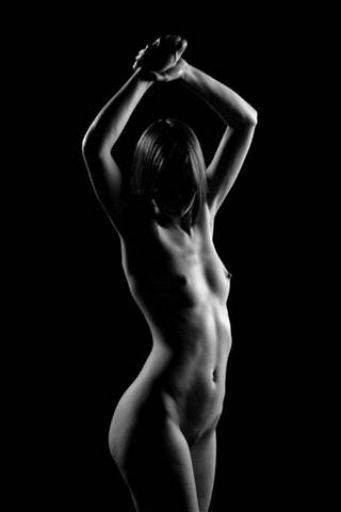
Looks like the one above is a crop from this image. While in general with fine art nude obscuring the face often works well, in this case the I think the face is just too dark. Something in the processing has left the highlights a little too burnt-out - especially on the ribs. This type of monochrome could easily take a hint of toning - especially a warm / sepia tone.
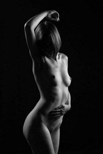
Nice variation on the pose, though the hand does look a little large. This also exhibits a very common problem that hands are often a darker tone than the rest of the skin, so they can appear darker, heavier and unbalanced. A little judicious local lightening just on the hands could help with this image.
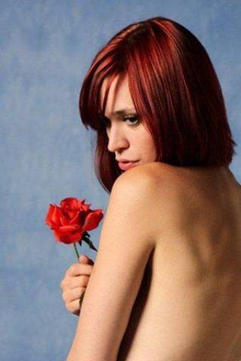
Nice colour image, love the thoughtful expression on Lou's face. There's just a hint of a leaf between her hand and arm that could be cleaned up. I think this image would be much stronger as a cool-toned monochrome and a vignette would help as well.
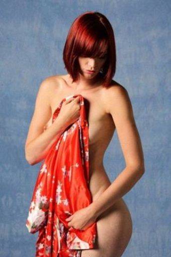
Nice colour contrasts, a tricky shot to pull off because there is a lot of light. Again a vignette on the background would help and I also think you could probably bring up the colours a little - try a little vibrancy.
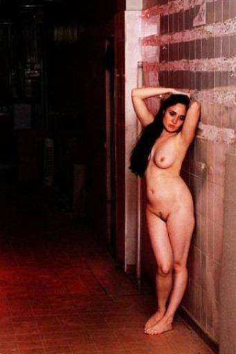
These next few images are shot in a long corridor with a red light flashing from a doorway just behind Leah and a white flash near the camera. This can be quite a challenging set up to put it mildly.
In this image I think that dark area is too dark, there's probably a little more detail in the raw file that could be brought out. On Leah herself the lighting is a little direct.
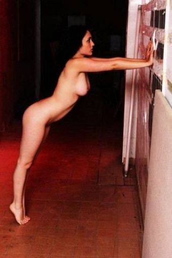
As above the dark is too dark. The image is also not straight. I do like the pose - a very strong shape.
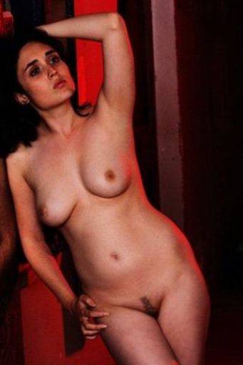
Like this shapes, crop and pose in this image. This shows the red light very well and the background works well on this image. The skin looks a little dirty and mottled - I think this is probably a combination of high ISO, the lighting direction and a slight under exposure. Smooth the skin out to help. The face is also a little dark and could be locally lightened.
Overall a good set of images, the earlier ones are very fine and the later ones are OK, but working in more challenging lighting setups means they don't have the strength of the earlier images.
share:
I run regular workshops for beginners and experts alike. I like to run a mix of styles and types. Masterclasses, portfolio builds, technical and artistic sessions available.
Current courses available.