Red Sofa

Black and white and red all over - no it's not a newspaper, it's our strongly themed set.
The core red and white sofa and cove are already strong, so we need a black outfit rather than coloured to keep all the colours strong and contrasting.
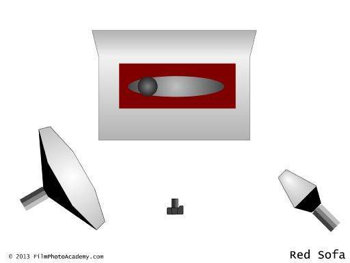
There is one main light to front and left, with a fill light to front and right - but positioned much further away from the subject. This gives a fairly soft and even lighting across the field but with just enough shadow to add form and shape. The cove is lit with two lights above the corners to keep it clean and white.
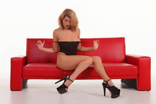
This first image clearly shows that you need to use strong posing to match the strong environment. It would not work at all to have soft, gentle posing in such a setup.
So the pose is all angles, stretched and pulling. A very typical "fashion" pose but with a direct gaze to camera.

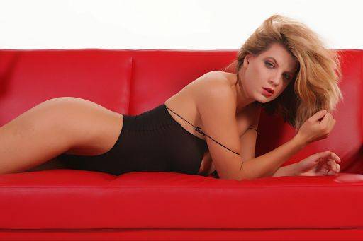
In this image I've cropped in tighter. When framing shots like this it is generally better to either get both ends of the sofa in or neither. To have one end showing doesn't always work so well (See the third image).

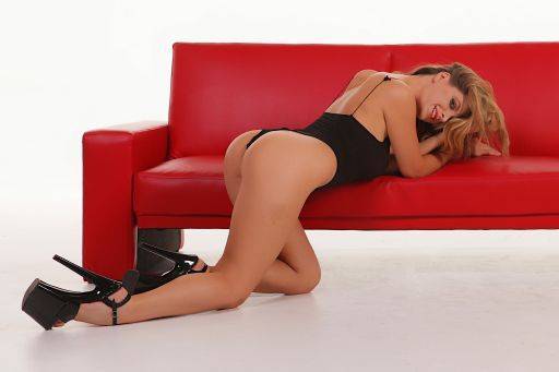
On the plus side of this image I've moved the model to the floor. When using a prop like a sofa or chair it's so easy to forget that the floor can be used as well. Particularly for a set like this it gives another collection of posing possibilities altogether.
On the negative side you can see what happens when you only show one end of the sofa; it has a slightly imbalanced look to it. Of course there isn't really an alternative on this shot, because there would be too much empty space on the right hand side if I included the whole piece.
The better fix would be to just move the whole pose further along the sofa.

share:
You can learn how to develop your own lighting, posing and directing skills with our extensive and intensive range of video programs available on DVD or download.
Videos on DVD / Download