Review for Ian
Ian attended my workshop on shooting art nudes and portraits in natural lighting on location - the workshop was with Artemis Fauna in a prop-laden georgian house.
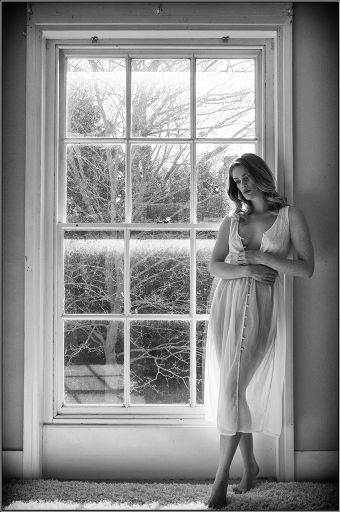
I like the serenity of this image. With everything nicely squared off, with the balance of Artemis inside and the tree outside, you have a scene which is really nailed down.
Minor picky things, The bright light at the bottom should be cloned out, I would also just stretch the left edge so there is a similar width margin as on the right.
Personally I find this a little dark, if it were my image I would brighten up Artemis a little.
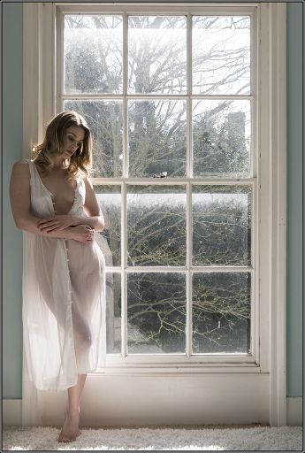
Much the same comments as for the first really. I do like the complimentary pastel tones of skin and blue wall. The light and shadow on the window in both of these images is quite distracting and flipping awkward to fix as well.
I like the layers of see through material, artemis beneath and the reflection in the window - the reflection is more obvious and effective in this image.
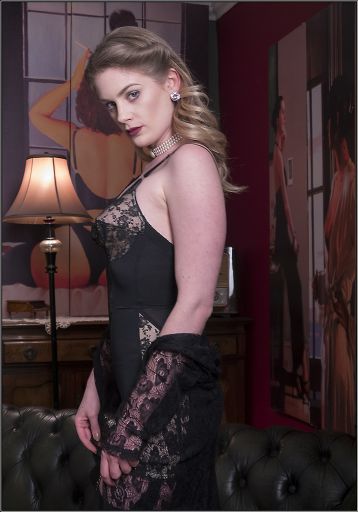
I was a bit surprised at how much depth of field there was in this image given the light conditions, but I see that this is at f5.6. You really want to get as wide as possible to throw the background out of focus as possible. I know with your setup for this image you couldn't get much wider. The alternative would be for you and artemis to come further forward into the room away from the walls a bit more.
Then, when that doesn't go far enough, you need to be really picky about camera position. If you look at Artemis' bust you've got a nasty conjunction of pointy corset, lampshade and underwear in the painting - it all gets a bit confusing. A slight shift to the left would really improve that. It would also have probably hidden the glare off the radio.
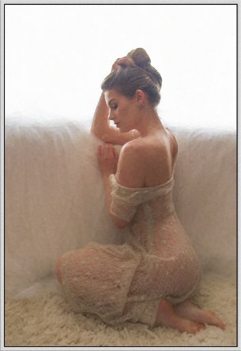
This is a nice treatment from this shot. Filters like this are very personal in taste. I would warn you that a judge will probably shoot this down, but personally I like it. It has given a really soft feel which works well with the setting. Lots of lovely texture already in the image as well.
I feel the edge of Artemis' hand and hair are just a little too crisp to go with the rest of the image. When cutting out, applying just a little soft edge brush or mask really goes a long way. You only need a few pixels softness to really help it blend.
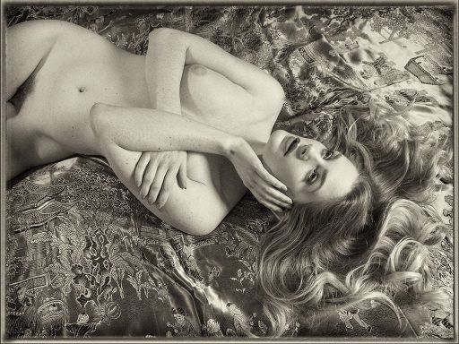
I would love to see the colour version of this - I remember how strikng that blue cloth was.
That said, this is a terrific black and white. A really great mix of fine details and soft shadows. A good depth of field has been a bonus here!
Some variations you could try would be (a) pumping up the contrast or clarity and (b) rotating anti-clockwise by 90 degrees. They may or not work….
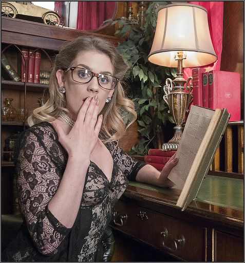
I'm less keen on this shot. Mostly because it doesn't quite look "real". Now I understand it is supposed to have an essence of fakery and melodrama about it, but I suspect you just missed the moment by a fraction of a second and now Artemis' face does not quite hold the right level of surprise and shock.
I know we went back and forth on the lighting on this very quick set, but if I were doing it again I would pull the main light down a bit so the lampshade provided more of the illumination - that is also part of why it doesn't look real enough.
The reflection in the glasses is distracting too.
I don't mind the business of the shot - though it would benefit from being toned down a little. You've got some nice lines in their too - notice that the book is parallel to the arm left?
The desk also provides some really good leading lines to pull the eye to Artemis.
Overall a good set - your black and white work is good as well as your colour.
share:
I run regular workshops for beginners and experts alike. I like to run a mix of styles and types. Masterclasses, portfolio builds, technical and artistic sessions available.
Current courses available.