Review for Steve
Steve was on one of my workshops - working with Artemis Fauna in a Georgian house we were exploring the use of location and natural lighting. Like all attendees Steve has taken advantage of the post workshop review - a very important part of the learning process.
Before going on to the images it is important to know that Steve has set out to create a RPS panel based on blur - whether motion blur, focus or other blurs.
I really strongly commend this - using the creation of the panel to fully explore a technique is great.
We could all learn from this approach - whether applying for panels or otherwise - by setting a personal target and fully exploring a technique or style really develops your overall skill set.
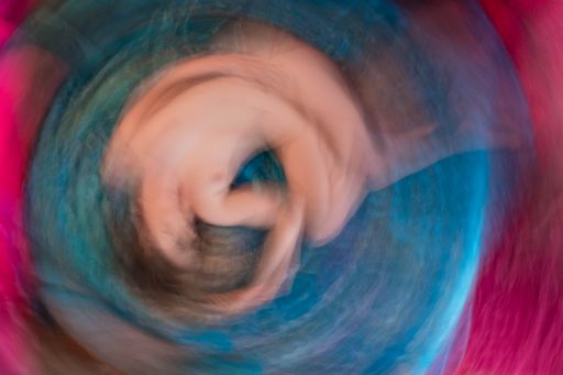
My most immediate thought about this picture is that it needs rotating. Rotate it 90 degrees and it is so much better.
I think this is very strong - when you have developed your skills so you can reproduce this at will is going to be a good test of how thoroughly you've mastered the process.
The way the two colours form an automatic frame and vignette around the image is very good.
I know what you are doing will have a strong element of personal taste in it - but to me this is just the right amount of blur - there is still a clear understanding of what the subject is, but at the same time enough distortion to really add a visual appeal.
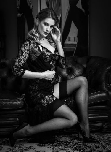
Nicely captured and a good presentation in black and white.
I recall some discussion of the pose at the time and it's not quite come off. The hands are too much to camera. The angles of the arms and legs are not coherent, they are all slightly different. Let's assume that we could work round the height of the sofa and get everything in the right positions then I would be looking to create either echoes or reflections in all the lines - from arms, to legs and the diagaonals in the background.
The background is nicely dark, but it would be great to have seen just a little separation on the left of image between Artemis and the background. Maybe we turned the back lamp off at this point? Or maybe the front light is too bright - this was a fixed light source with no power control but we could have feathered it more.
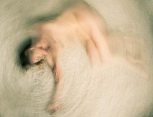
As for the first image, a 90 degree rotate looks better to me. I really like that the centre of rotation is off centre. I don't know if you did that in camera or in post - either way it is a really interesting addition to the process. It makes the image more dynamic - puts the focal point closer to the rule of thirds and all that.
Colour wise, I think you could experiment with the colour balance on this image - it feels quite greeny-yellow. For me shifting colour tones, balance and hue are all up for grabs!
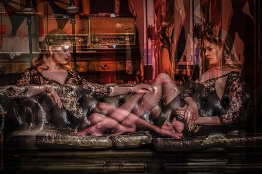
There are lots of images produce that rely on mirrored symmetry - what is really clever about this is that it is not mirrored nor symettrical - it hints at something familiar but isn't really. I really like that.
I think the lack of alignment between the two shots is very important.
There are two glitches that should be sorted out. The hand in the centre is much brighter (along with the little shine of the sofa) - this needs toning down because it is very distracting. Then there is a similar problem with shine on Artemis' forehead on the left hand side.
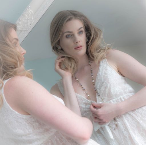
That mirror frame is really irritating, it might be a bit fiddly but the image would be so much better without it.
Your choice of camera position and angle is great - it gives a very dramatic look, very striking.
To be really picky, it's a shame Artemis' face on the left is covered by so much hair, just pulling the hair back would make such a difference. I would also soften out the crease in the armpit.
I love the soft delicate tone throughout the image.
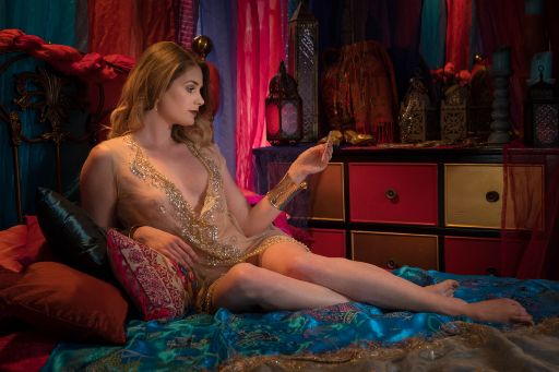
This image is so close, at first glance it is great, lovely colours, interesting pose, good light and tones. But when you stop and look at it more closely it doesn't quite hold up I'm afraid…
From left to right:
The left edge is a little too dark.
The resting arm has the back of hand to camera
The sunlight from behind doesn't quite make sense (maybe we should have put the sideboard lamp on again?)
The card/photo she's looking at is too side on to be clear.
The knees are all pointing towards camera, the legs could have been stretched more.
This is an example where a little less haste and a little more attention to detail - especially in the pose - would really make a better image and a better story.
Overall I really like the creative way you approaching your photography. Both the blurs and the straight images have that extra element in them. Be wary of putting them in front of camera club judges - they may not get what you are doing.
I would really like to see your panel when it's done.
share:
I run regular workshops for beginners and experts alike. I like to run a mix of styles and types. Masterclasses, portfolio builds, technical and artistic sessions available.
Current courses available.