Richard Critique
This is a critique on Richard's session with Leah Axl. The focus of the session being developing portraiture and creating some very successful images. Overall, if Leah had been a client she would have been very happy with these - you would have made a good sale :)
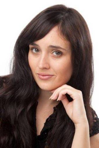
Like the pose, like the crop, like the catchlight in the eye, nice all round hi-key image. I'm not quite sure about the smile, it's somewhere between cheeky and fed-up - like all expressions its all in the moment, a fraction of a second earlier or later and it would have been different.
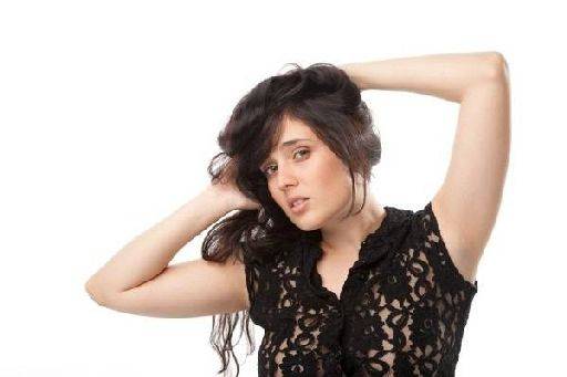
Nice, glamourous, active. Lighting works really well, even the little hint of additional rim lighting on the arms.
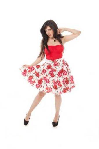
A little small in the frame, doesn't need all that space. Lovely full length image.
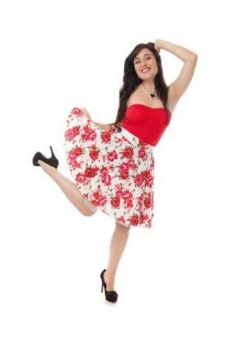
Same comments as above.
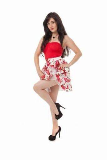
Not so sure about this one, I'm worried about the expression on the face. Your angle of shot has been perfect on this one. By shooting at a lower camera height you've proportioned Leah well. And if she's had photoshop help it's appropriately subtle.
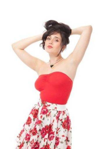
While everything about this is perfect, the eyes aren't, one is slightly more closed than the other. There's is maybe too much skirt at the bottom of the image.
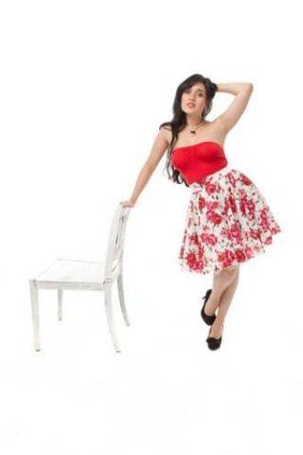
Very windy in the crop, what's all this white space for? Otherwise I like this, like the use the prop and the pose against it.
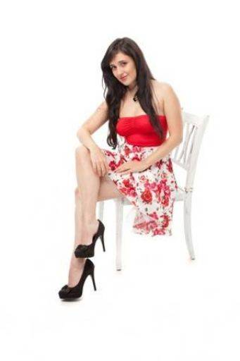
A very good sitting picture, these can be tough to get right, but you've got the legs turned away from camera which adds length and stops them foreshortening, you've got Leah with a nice positive lean to camera without slouching. Maybe could be cropped tighter. Good shot.
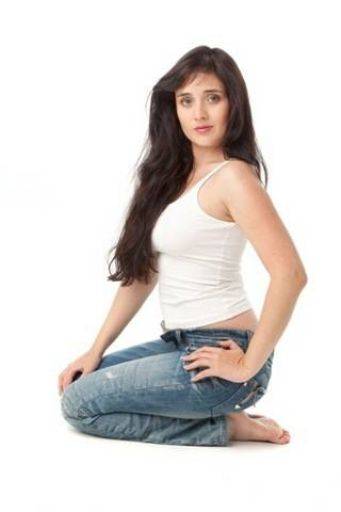
Lovely, casual, high-key image. To be really picky Leah's right hand could be slightly better but I am being picky.
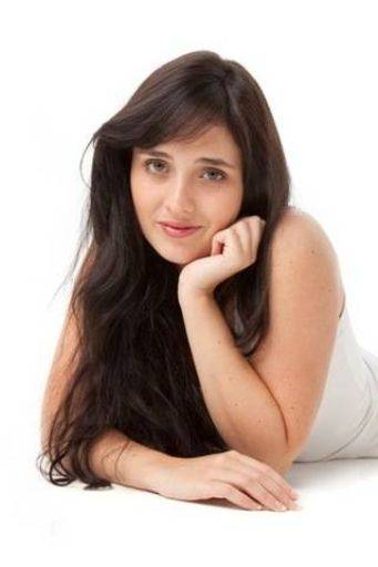
Smashing.
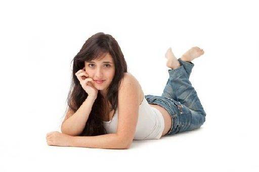
Hand is a bit claw like on the face and the crop could be tighter.
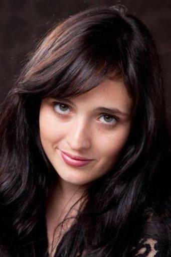
Lovely
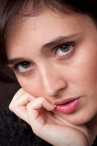
So's this (though the hand might be suspect and looks squashed the face is great)
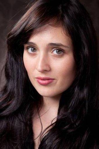
This is almost boring after the last few, perfectly competent.
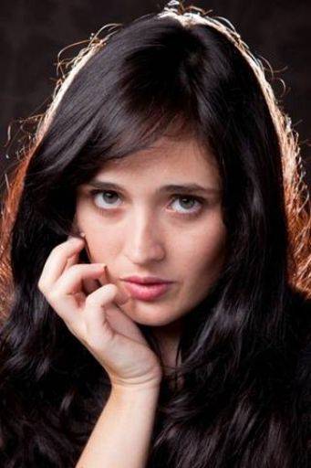
Very nice rim light on the hair. Smashing.
Overall Richard there's not much I can criticise in these images, there are competently taken, lit, and posed. Your choice of camera height, focal length and angle of shot all look very good.
I have a suspicion Leah might have been doing a lot of the work here, with you "taking" photos rather than "making" them. This shows in the expressions.
You need to lead your subject more towards the expression, emotion and feeling that you want - more studio blather basically. Then you need to pay more attention to the expression as it gets there. Every change of expression has a crucial moment when it's perfect, a lot of moments when its OK, then a most of the time it's not.
What I'm seeing in a lot of these is where the look has gone. If you prefer to work more slowly, then develop the pose until it is how you want it, then through interaction with the model get the expression and be ready to snap at the right time.
But, more likely, you need to chat more, keep the sitter motivated, interested and moving and shoot more, be ready to hit the shutter at any moment.
This is a bit of critique I don't normally get as far as because usually people are wrestling with more basic errors. These are a really nice set of images and you are down to tuning the very fine details in YOU, rather than the technical stuff now.
share:
I run regular workshops for beginners and experts alike. I like to run a mix of styles and types. Masterclasses, portfolio builds, technical and artistic sessions available.
Current courses available.