Richard - post workshop critique
This is a critique of images for Richard, following a recent Royal Photographic Society workshop. All my workshop attendees can send images for critique after the workshop as I believe this is a vital part of the workshop process.
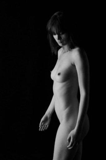
Nice mono image, nicely shot into the darker "short" side of the torso. I like the whole pose and the framing to the right of the image.
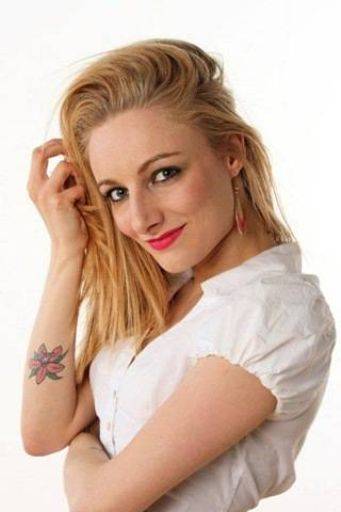
I think you've caught the wrong moment here, it looks like you've just missed the smile and it's about to fade, so what you're left with looks more fake than real. I also don't like the clawed hand in the hair. Sorry, don't like this one.
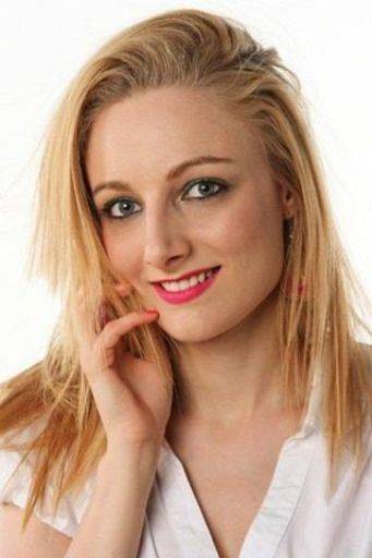
Whereas here the expression moment is caught well, there's a perfect smile with a hint of curiousity that makes you want to know more. The hand - although a little claw-like - is posed well against the face and I like the fly away hair too. You could also crop this image a lot tighter and get a better shot.
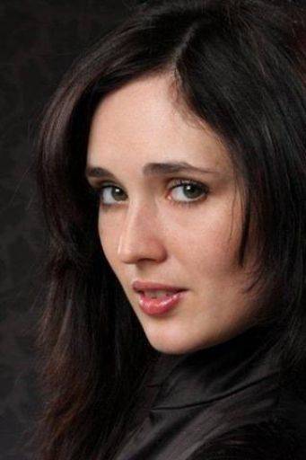
Not sure about this, because the face is turned to the light, it's a very flat light across the face which I don't think works. I'm also bothered by the way the hair - especially top right, just merges into the dark. Although the three quarters turn of the face can be a fine pose, it does make the eyes look awkward, especially on the left hand side.
The fix would be a slight turn to the camera, this would have brought a less flat, more shaping light to the face, cut out the cross-eye effect and slimmed out the face too.
It's all in the detail I'm afraid - sorry if I sound hard on this image, it's frustratingly close, but...
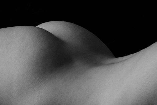
Lovely figure shot and I like the landscape format. There's too much at the base of the image - you could crop at least half that flesh out to leave a much slimmer looking back - then add in an equivalent amount of black, negative space at the top. This would put the "horizon" onto the bottom third line - to fit the rule of thirds, eliminate the "mass" of the body and by having the "horizon" on the bottom will create a better balanced image.
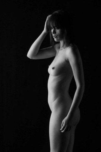
I like this, pretty much every comment I made about the first image applies to this one.
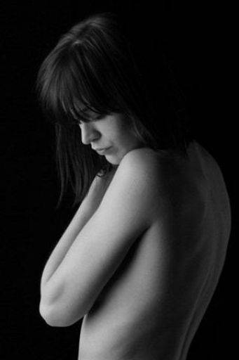
Smashing. Look at how shooting into the shadow has worked so well here. The hint of reflected light nicely finishes off the right hand edge to give a complete shape and the lit side is a small proportion of the shape. The head down, eyes closed works really well. A lovely and thoughtful image.
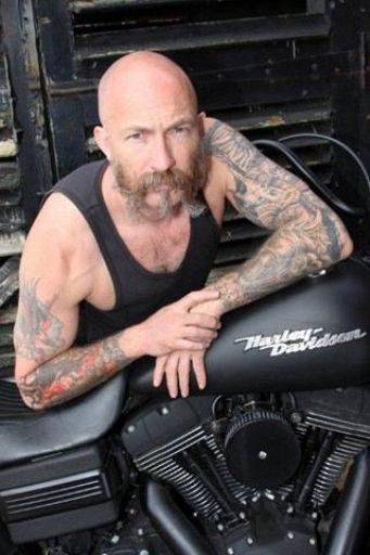
Nice to see some Hayden. Trouble is the light is all a bit full on his face, it would have been so much better with the light skimming across from behind and to the side. The pose, framing, shape, camera angle and great. Love the shine around the Harley logo.
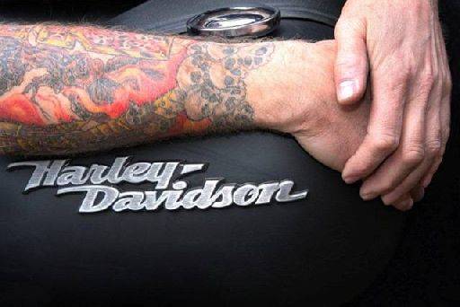
Well seen image, really nice combo of tattoo and logo. It looks a little burnt out - especially the hand on the right. I think you could darken this down a little (especially at the top) and bump up the contrast and see if that really brings the story out.
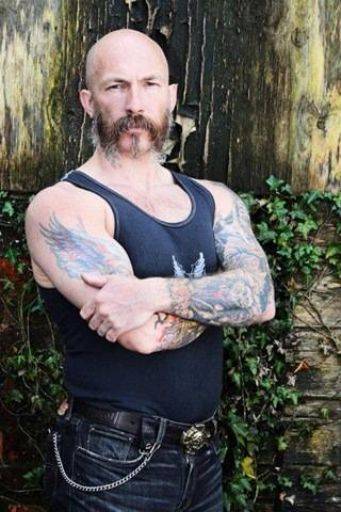
Terrific pose for the man, terrific background, love the strength of the man in his eyes. Light is soft - a speedlite to the side could have really brought out the punch. Think you could look at some more sharpening for punch and some additional contrast. You could also experiment with a bit of colour tweaking, maybe a hint of blue tone to cool him off.
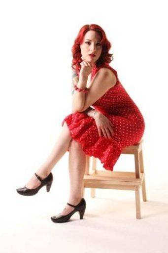
Sitting poses are so awkward and this one has been carried off well. Tefnut leans forward bringing the viewer into the image and the hand crossing over onto the thigh stops any blocking up on the waist - a common issue with a sitting pose. The cross legs do make the thighs look slightly large and sadly the stool is a little busy and distracting, but overall I like this.
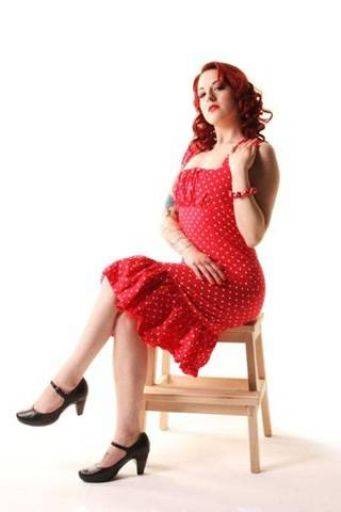
Much of what I said above applies here, but the pose isn't as good, because the model is sittting back it loses the engagement with the viewer. Both hands are suffering from "banana syndrome".
I think you need to go back to your original images and have another scan because I think you're missing some "critical moment" images. Quite a few of these are just "off" - either off the moment or off the pose. If this is your first time shooting portraits in studio then you've got a good start and a little practice would move you a long way.
A good variety of shots though, a nice mix of styles, colours, mono, nude, fashion and portraits. You've seen some nice opportunities during the shoots.
share:
I run regular workshops for beginners and experts alike. I like to run a mix of styles and types. Masterclasses, portfolio builds, technical and artistic sessions available.
Current courses available.