Rich-Photo Critique
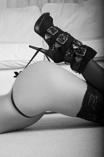
I love the way this turns the cliché on its head by having a 'normous boot instead of the usual dainty high heels. The vignette on the right is a bit suspect - should either be on both sides or not all. Would be nice if the background was a bit more out of focus - go to the widest aperture you can.
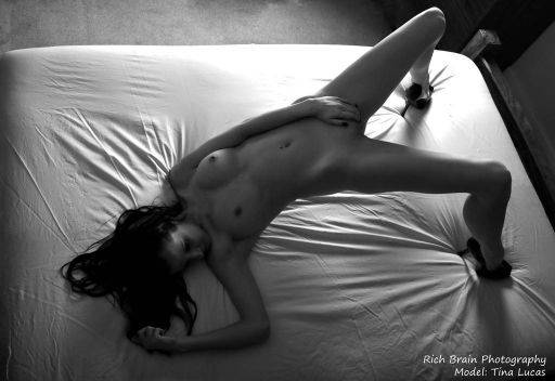
Now this works because it's black and white - hence it is "art" - in colour this would not be the same shot. Although wide angle, that works here because of the whole nature of the pose. The side lighting works well adding a nice sense of drama, but still enough reflected light to keep detail in the shadows. The contrast between figure and ground works well.
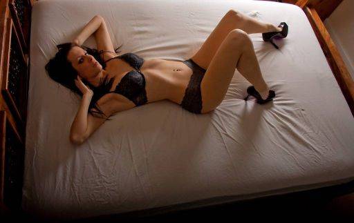
Whereas, all the positives in the shot above work against it in this one, too wide angle, awkward pose, looks like she's got a splitting headache. This is very ho-hum, average.
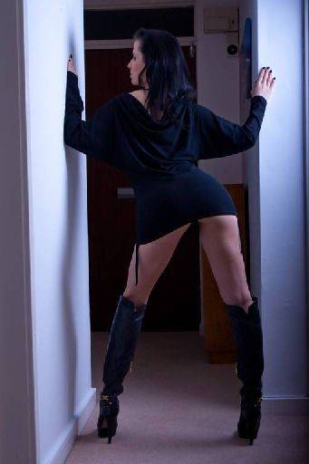
The cool toning on this shot is interesting, not sure if it works though. The whole shot is a little under exposed so it's all a bit blocked out, with no separation of figure from the background. The background itself is too sharp and cluttered. Again a wide aperture and a slightly brighter image may have worked,
Because none of the verticals are vertical it's hard to look at.
Whereas this is an improvement, although shot in the same space, because the sitter is properly lit, though she could still do with the some separation from the background. The dangling suspender belt or string or whatever it is is distracting.
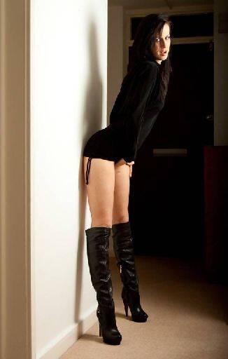
Could have been perfect, but the cloth at the top needs cloning out because it's so distracting. Again it' is a very wide angle shot, but your placement relative to the subject has helped extend the body, though it has made the legs look a little short.
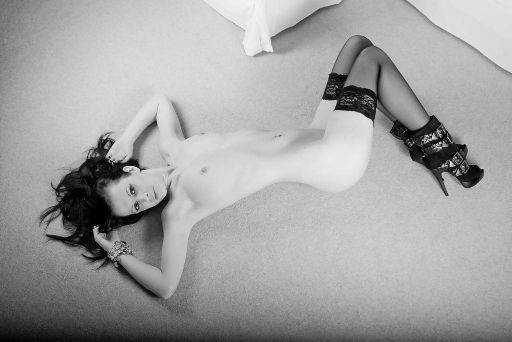
Nope. To wide angle, cliché pose., no light in the eyes, you can do much better than this. It's barely better than a Readers Wives shot really.
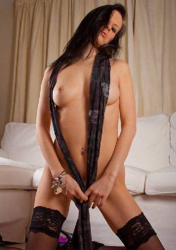
Good use of colour, strong vampy pose works with the outfit. The background on the left is distracting, either clone it out, or just shoot with the model a little closer to you. I realise this is shot in limited space. The face could do with just a little more light on it, maybe the head a little higher and turned slightly more to the window - even if the gaze is direct back to the camera.
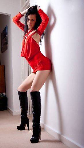
One of the issues you have shooting in small spaces is that to include the full figure you need to shoot wide angle - which in turn leads to all sorts of horrible distortions, both on the figure and the walls etc around. The only real solution is to not shoot full figure, but zoom in more. You can to a certain extent use camera placement to use the distortion to your advantage, but it will always be distorted.
A lot of these shots would have been helped by an additional light source behind the figure to create a separation from the background.
Shooting with the widest aperture would drop the backgrounds more out of focus and would also help.
Finally, I'm not sure what you are using as your vignette tool, but it seems uneven, giving stronger vignettes on one side than another, leaving you with unbalanced images.
So, images 1, 2, 5 and 8 are good, strong and interesting images and worth pursuing the ideas further.
share:
I run regular workshops for beginners and experts alike. I like to run a mix of styles and types. Masterclasses, portfolio builds, technical and artistic sessions available.
Current courses available.