Workshop Critique for Joan
At every workshop I run, attendees can always send me images after the workshop for review. This of course allows photographers to do the appropriate post-processing on their images and also to consider what they felt worked well and where they feel they want some further advice. All the images in this item are copyright 2009 Joan Blease. Joan was one of the attendees at the Royal Photographic Creative Nudes Workshop last week, she has dropped me a couple of images for critique. Joan - I'd like to see some more please.

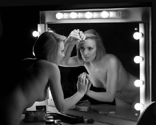
The mirror was obviously a hit with all the photographers. I really like the overall composition, framing and posing on this shot. We see Cat's figure from different directions which is nice. The hands on the frame help bind a circular composition, so the eye tracks round her two figures. It would be easy for the lights on the edge of the frame to pull the eye out of the picture otherwise. I am bothered about the hands though, both hands are large in the picture and also fall over other parts of Cat. The top arm merges across her left face and the bottom arm merges into her chest. Both could have done with a little separation. Also, the shape of the hands makes them blocky and large in the frame (because they are doubled up). I understand the way this was shot that actually you probably had no choice about this, but worth noting if you were to try this again. Also, one of the interesting aspects of working with mirrors is the eye contact. Does the model look to herself, to the camera in the mirror, or to the camera directly - each type gives a completely different image.

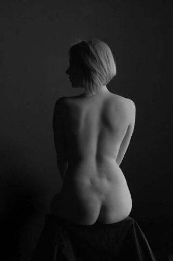
The modelling from the soft light is lovely on this, Cat's shape is revealed really well. There's good separation of the figure from the background all round which is also really nice (and often very difficult in this kind of black and white setup). I think that either you or Cat had a slight turn - I can see her leg on the left hand side - I know the image you were trying to capture and I think you missed the symmetry of the image. On the left hand side of Cat's waist there's a hint of separation of waist and arm, I'd just like to see the brought up a little, it would help Cat's waist slim down and make the torso less blocky. I really like the silhouette of Cats profile. Are you going to paint on cello holes then? Finally a comment on both the images, I'm not sure if its because of the reduction to email them over, but they are both lacking a bit of "bite". Do a search for "photoshop local contrast enhancement" and read a couple of tutorials - I think that's what might be missing. But also I think you might want to have a fiddle with Curves too, just see if you can pull a little more punch out of them. The second image also looks a tadge dark, you could probably add a lot just by lifting the overall brightness levels a bit.
share:
I run regular workshops for beginners and experts alike. I like to run a mix of styles and types. Masterclasses, portfolio builds, technical and artistic sessions available.
Current courses available.