Workshop Critique - Peter Spring
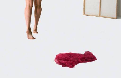
I do like your thinking on this one, a great idea. For me it doesn't gel, some how the elements don't seem to join up, I think it's because there's no grounding to Cat or the drape - it needs either a little shadow or a little reflection to stop them floating.
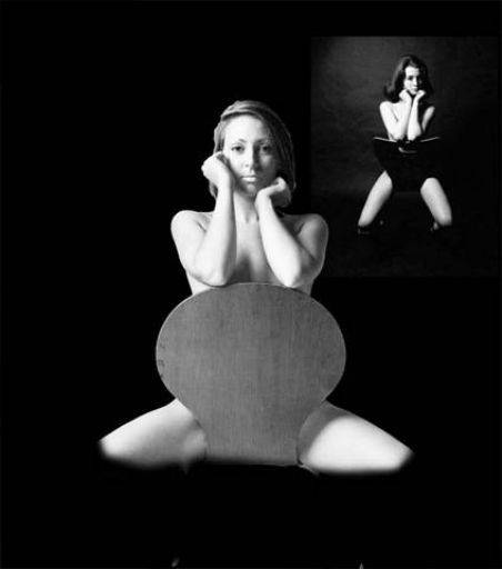
Now this is clever, I suspect you've seen that getting the legs right is crucial in this image. I've shot this quite a few times and getting the legs right is really difficult, so dropping them out to a vignette is really clever.
I like the slide-show effect on the top right, like Christine is projected.
The cut-out on Cat is a bit rough, especially around the hair line.
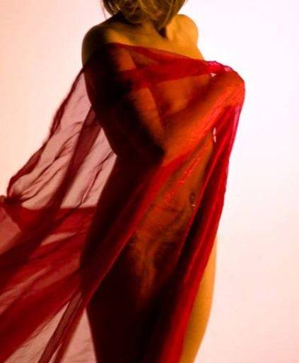
This is an ambient light shot and I'm not sure about the the really strong orange cast on Cat. The red cloth is terrific and I do like the overall shape of the image and the crop across Cat's face. The shape of Cat's back on the left hand side of the image is a little odd. I'd be tempted to warp that into a more pleasing shape.
I'd also be tempted to try and bring a little more highlights into the red cloth, even painting them on.
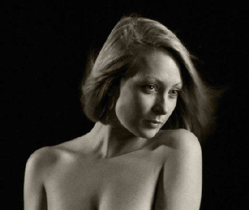
So close to being a lovely portrait but for me the eyes have slipped from a "pleasing lack of definition" to just blurry. The eyes are always crucial in sharpness, the rest of your image can go to pot, but the eyes need sharpness. Looks like motion blur to me - is this ambient light again?
Love the softness in the hair as it's moved around.
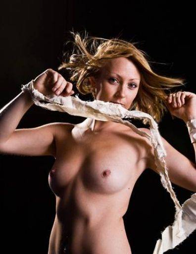
Good use of the wind machine, that hair is terrific given Cat has such short hair, the rim light across the hair is great too. In fact you've got Cat at exactly the right position for the lighting. Across the main torso you've got terrific light and dark tones giving absolutely maximum modelling and giving brilliant shape to Cat, and the rim light is absolutely spot-on on the left hand side.
To be picky, I'd like to just tune up the crease on the right hand side of Cat's waist.
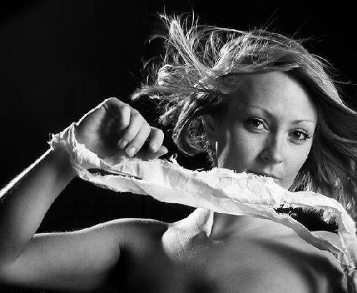
Good crop of the same image, focussing on that hair and the eyes. The black and white conversion you've used I think is a little hard for feminine skin, it's almost like the blue channel of an RGB. You might want to try converting to monochrome with a red channel bias - that smoothes out the skin on women.
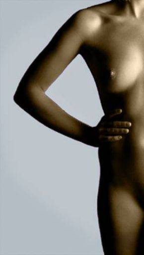
Good crop, good shape in the figure - I suspect this might be a touch of "mother of invention" - was the right hand side blown out? To me it doesn't quite look vertical either which bugs me.
Nice tonality across the figure.
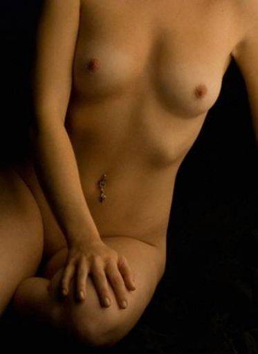
Don't know if this is noise or added grain, but I like it. Really nice soft light - this is a terrific low-key image. The hand is sadly a big in the frame.
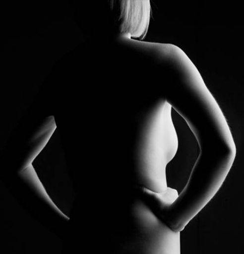
The right hand half of this image is good (though it does look a little burnt out), it's the left hand that lets it down. Because there's no separation of Cat's torso from the background it loses the form. If you could find just a hint of grey in the background to separate her out that would be great.
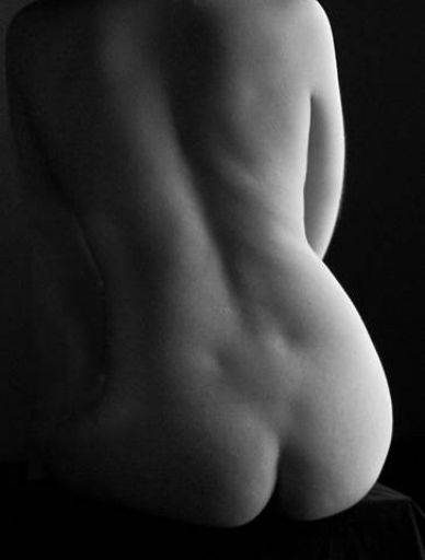
This is close, but it has two problems for me. Firstly the left edge is just too dark, if you could find a hint more light in there it would be better. But it's the right hand skin that bugs me, it looks twisted, but not enough to be artistic, but too much to work.
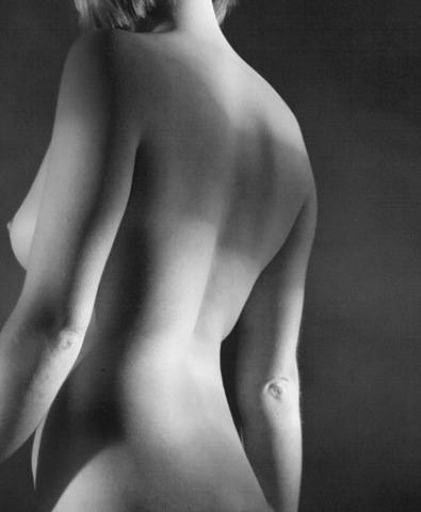
I like the very unsettling nature of this. The position in the frame, the crop that takes out the head and hands, the fact that the crop is so tight on the right. All these things break the rules of conventional composition and as a result leave you with an image that is unbalanced and disconcerting and I like it for that, it's like a niggly tooth you have to keep poking with your tongue.
Picky note, the wrinkle on the elbow, a slight bend in the elbow would have zapped that.
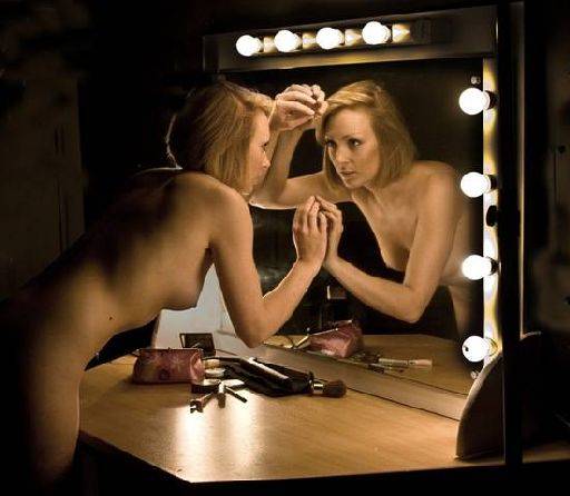
This mirror did go down well - I suspect everybody's got a mirror shot. Same problem as everyone else as well which is the hands are too big and doubled up too big in the reflection. I'd like to clone out the mole on Cat's waist, and the glint of her button jewellery in the reflection - they are strongly distracting to me.
What happened to the paint pictures? Did you get nothing useful from those?
Overall a good set, there's been some lovely capture of light in them, which I hope was deliberate, the difference of the lighting just by rotating the pose a couple of inches makes a huge difference.
share:
I run regular workshops for beginners and experts alike. I like to run a mix of styles and types. Masterclasses, portfolio builds, technical and artistic sessions available.
Current courses available.