Workshop image critique for Robert
After every workshop I give the opportunity for attendees to send me a selection of images, so that they can be reviewed and advice given. These are Robert's selection:
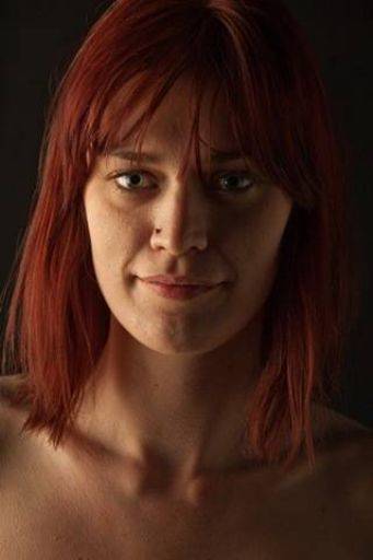
Hmm, this lighting is really setup for a full length body image and with this close-up of the face it really highlights the flaws as well as being in a slightly odd direction.
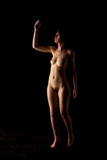
The pose on this, maybe combined with a wider-angle zoom has led this pose to look very big around the hips. I do love the soft gentle wrap of the right which is perfectly placed on the figure.
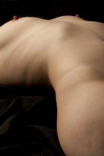
Very interesting and a terrific angle across the body. Although it's clearly recognisable as to position and view, because it's such a non-standard angle it really makes you want to look. It makes you see the body in a completely different way. Very interesting.
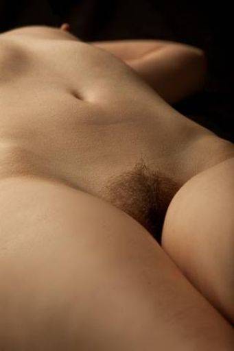
Similar to one above, but the focus on the pubes doesn't create the same sense of "difference" that the previous image does. I like the diagonal composition.
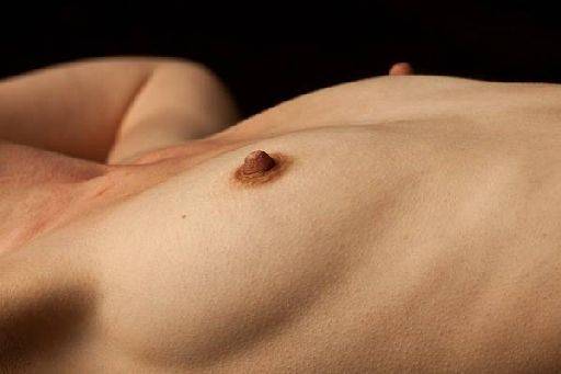
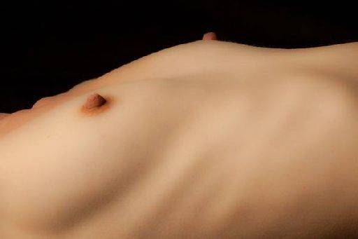
I'm going to treat these two images as one. Although the pose, frame, lighting is almost identical it's clear the second image is much the better. The distractions of the arm and odd tones around the next are removed and the skin looks much more feminine. This shot may have been better if Lou was standing, she's lying down here, which has flattened the bust to a less flattering and less interesting shape.
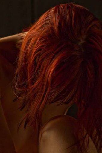
Love this, love the darkness, the wonderful shape, tone and texture of the hair, the complete lack of eye contact. Terrific.
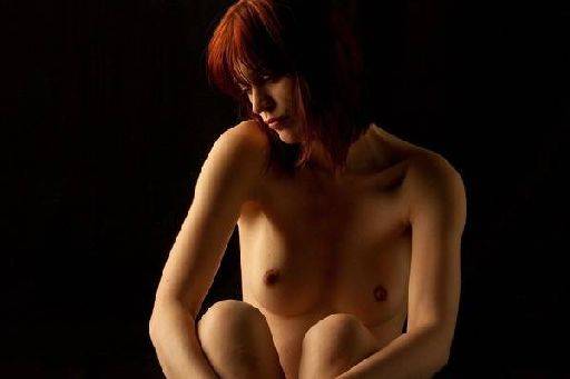
This is a lovely shot except for the crop. I find this cut across the limbs very difficult to the eye, with the angles formed by the shape it's hard to see how you could have cropped it differently. The light across the face and torso are lovely.
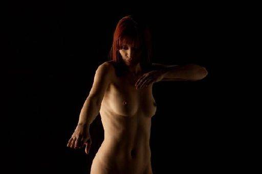
Again a really interesting lo-key image, the whole form of the figure is shown perfectly. There's one minor issue, the slightly awkward hand on Lou's right. I'd also like to see a little more of Lou's left hand, you can easily bring up the light level just to finish off the left hand of Lou, the right hand of the image.
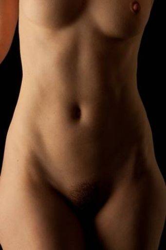
I like the overall composition of this image. One thing does need fixing, the tiny black triangle bottom left. For me I like the one nipple in, one nipple out crop - that might not be liked by everybody (i.e. club competition judges). I'd also be tempted to clone out the arm on the left of the image to simplify it even further and strengthen the perspective on the torso.
As a series of low key fine art nude images these are smashing selection. I'm pretty sure they'd make a really good monochrome set as well.
share:
I run regular workshops for beginners and experts alike. I like to run a mix of styles and types. Masterclasses, portfolio builds, technical and artistic sessions available.
Current courses available.